Project Brief:
The intent of this project was for us to design a second-story museum space in the Short North of downtown Columbus, Ohio to house a specific chair from a famous designer that we were to choose and research. What we discovered about the designer and, especially, the chair was supposed to influence the whole design of the museum. The first step of this project was to research the designer, their past projects, style, etc. From that research, we had to choose one of the chairs that our designer had created and draw it so that we could get a better understanding of the makeup of our chosen chair. Next was designing the actual museum space that would display the chair, focusing on the design principles of path, framed views, natural light, sequence of events, and materiality, while also paying attention to the square footage of the different spaces within the museum. Once our model was completed, we also had to create various drawings of it.
Process:
We started this project by researching the designer. We were all assigned partners and, together, we created a presentation of research that we had done on our chosen designer and the chairs on which we each chose to base our museum designs on. My partner and I chose Lina Bo Bardi to be our designer to inspire this project. Bo Bardi is a famous architect and interior designer. She is known for her architectural designs of Casa de Vidro, Casa do Chame-Chame, MASP, MAMB, SESC Fabrica Pompeia, Teatro Oficina, and many others. The Bowl Chair that I chose to work with for this project was created by Bo Bardi specifically for her Casa de Vidro (The Glass House). Lina Bo Bardi can not be categorized into a specific artistic/architectural movement, or, more so, she did not place herself into a single movement, or as she called them: “rationalist show-box architecture.” However, most of her designs are modern, and she also picked up Brazilian architecture while she was living there. Bo Bardi’s designs did show that she was very politically aware in her society, and, sometimes, they almost seemed to voice her beliefs, such as about the military dictatorship in Brazil and the Italian Resistance Movement during WWII. After moving to Brazil and becoming more aware of their economy, her designs were really people-focused, rather than for the government. Lina Bo Bardi also did not stay within the conventional design standards, as she was very experimental with her designs and pushed to stay out of the box. Bo Bardi also tried to bring nature into many of her designs. Human interaction was also a big part of her designs, so she used more organic shapes and took human proportions into consideration. Bo Bardi’s time in Bahia affected the way she designed too, as afterward she was committed to just Brazilian architecture. For her furniture designs, often they were made of common shapes and objects with locally found materials. These characteristics of her designs can be seen in the Bowl Chair that I chose with its organic, spherical shape, and locally found materials, such as steel and leather.
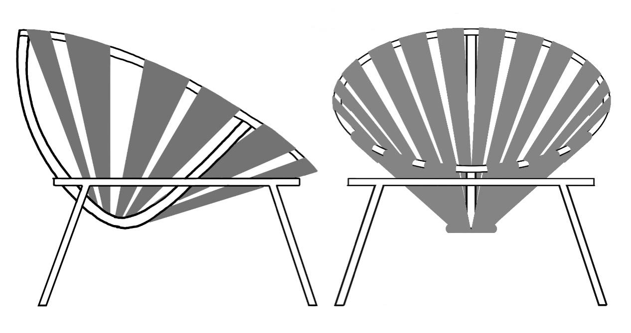
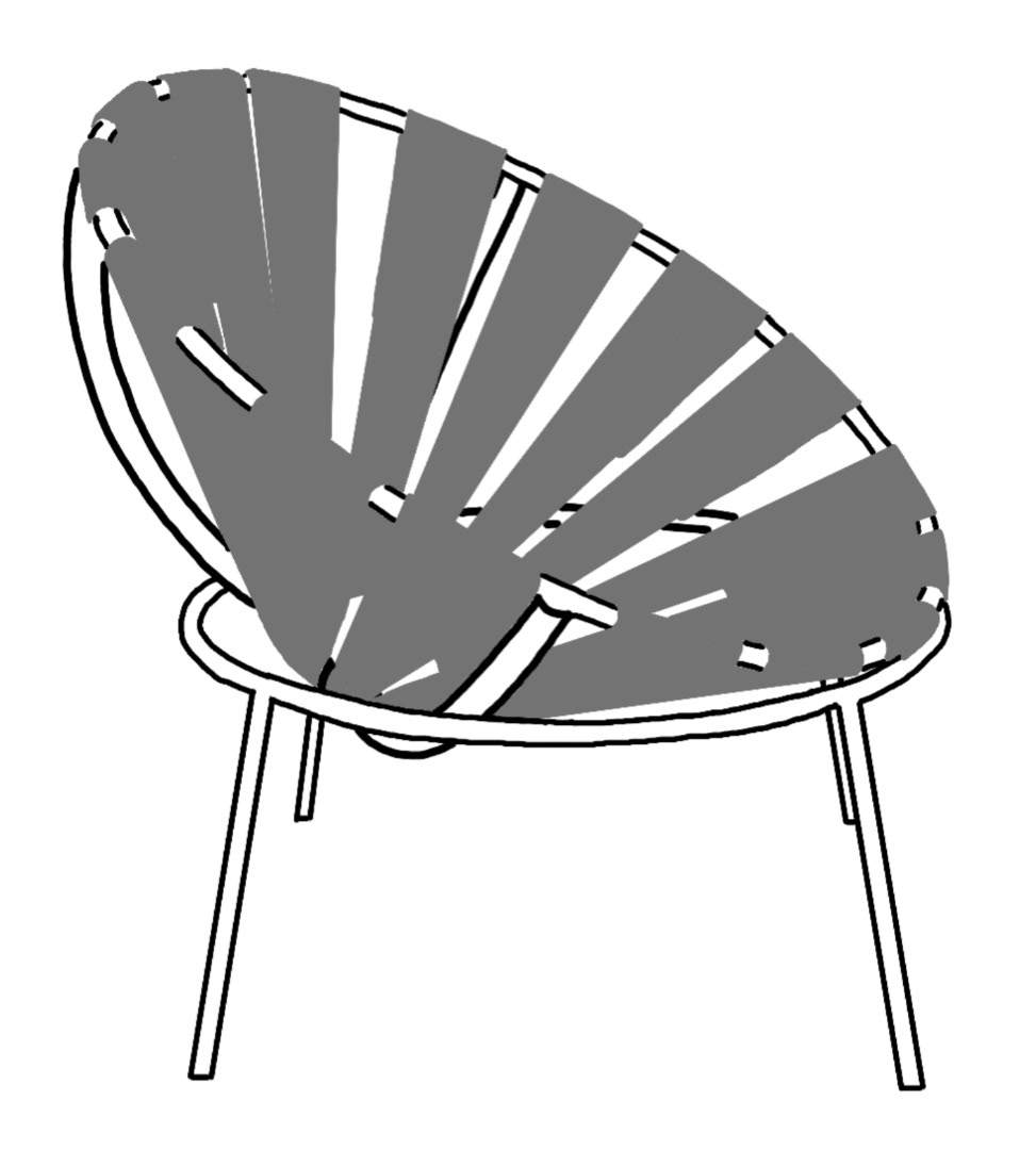
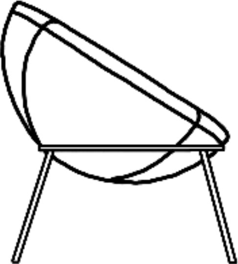
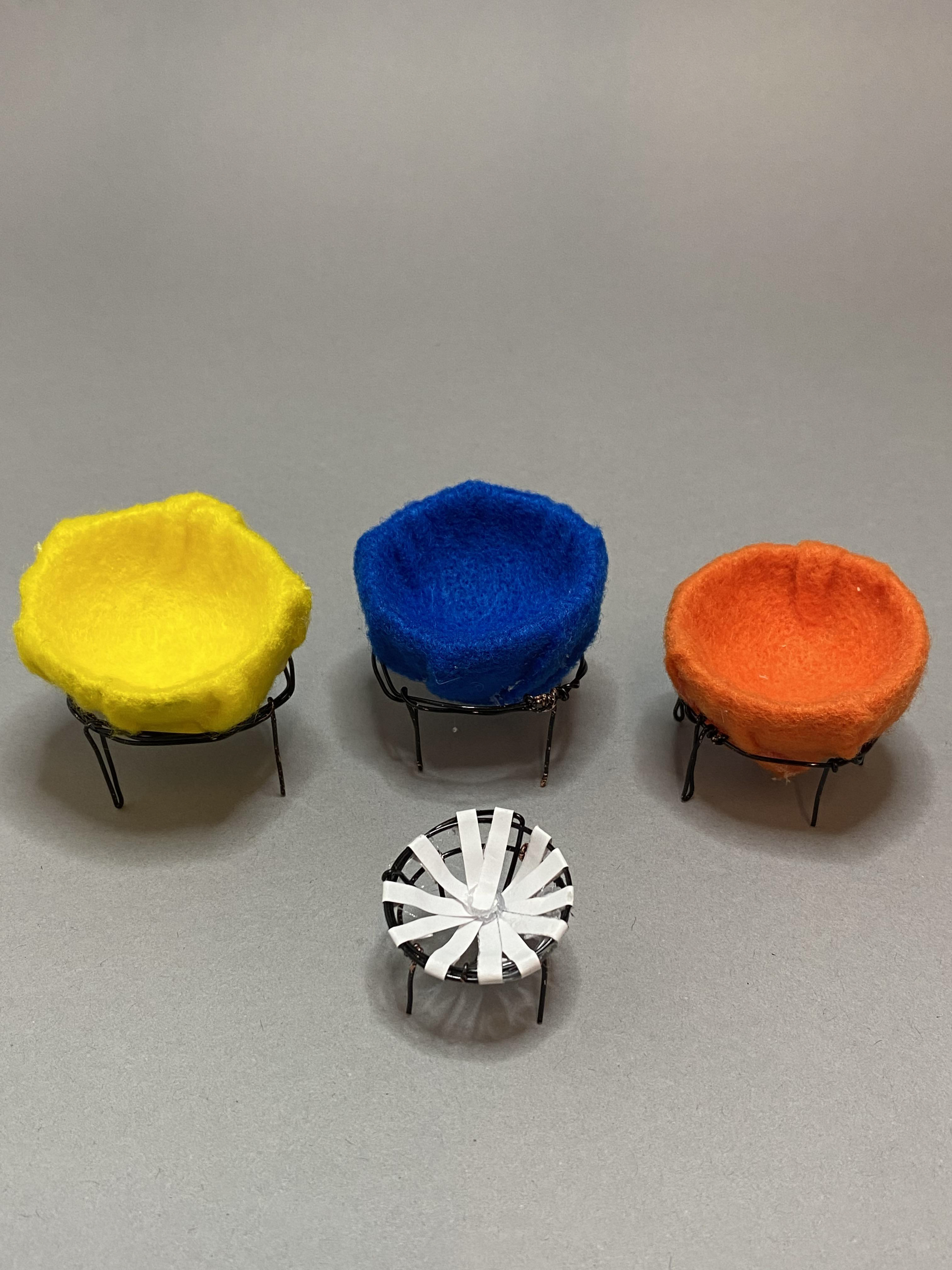
I chose Lina Bo Bardi’s famous Bowl Chair to inform my project. Specifically, I chose her Bowl Chair with brown leather straps, as I think the leather straps are an interesting juxtaposition to her original style of the Bowl Chair with bright-colored fabrics and a more rounded seat, versus the straight lines in this one. However, I did end up using the more well-known style of this chair in my museum, as well, to showcase the strong differences. Before starting the designs for the museum space, we were to create drawings of our chosen chair to gain a better understanding of its form and how it could influence the spacial design of the museum.
I began my design for the museum by gathering inspirational images. Most of these were of the Bowl Chair and interior and exterior pictures of The Glass House, Lina Bo Bardi's personal house she designed for herself, which she created the Bowl Chair specifically for. Other photos that I collected were to inspire certain elements within my design of the museum.
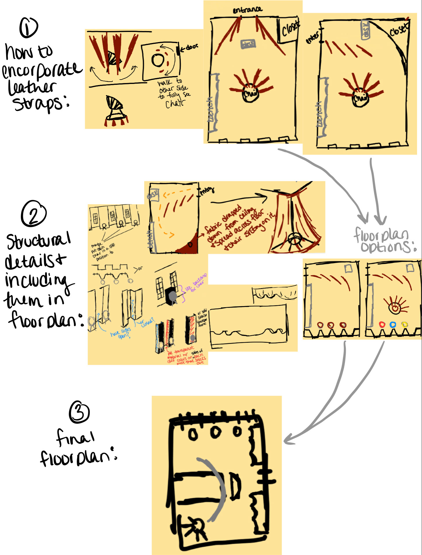
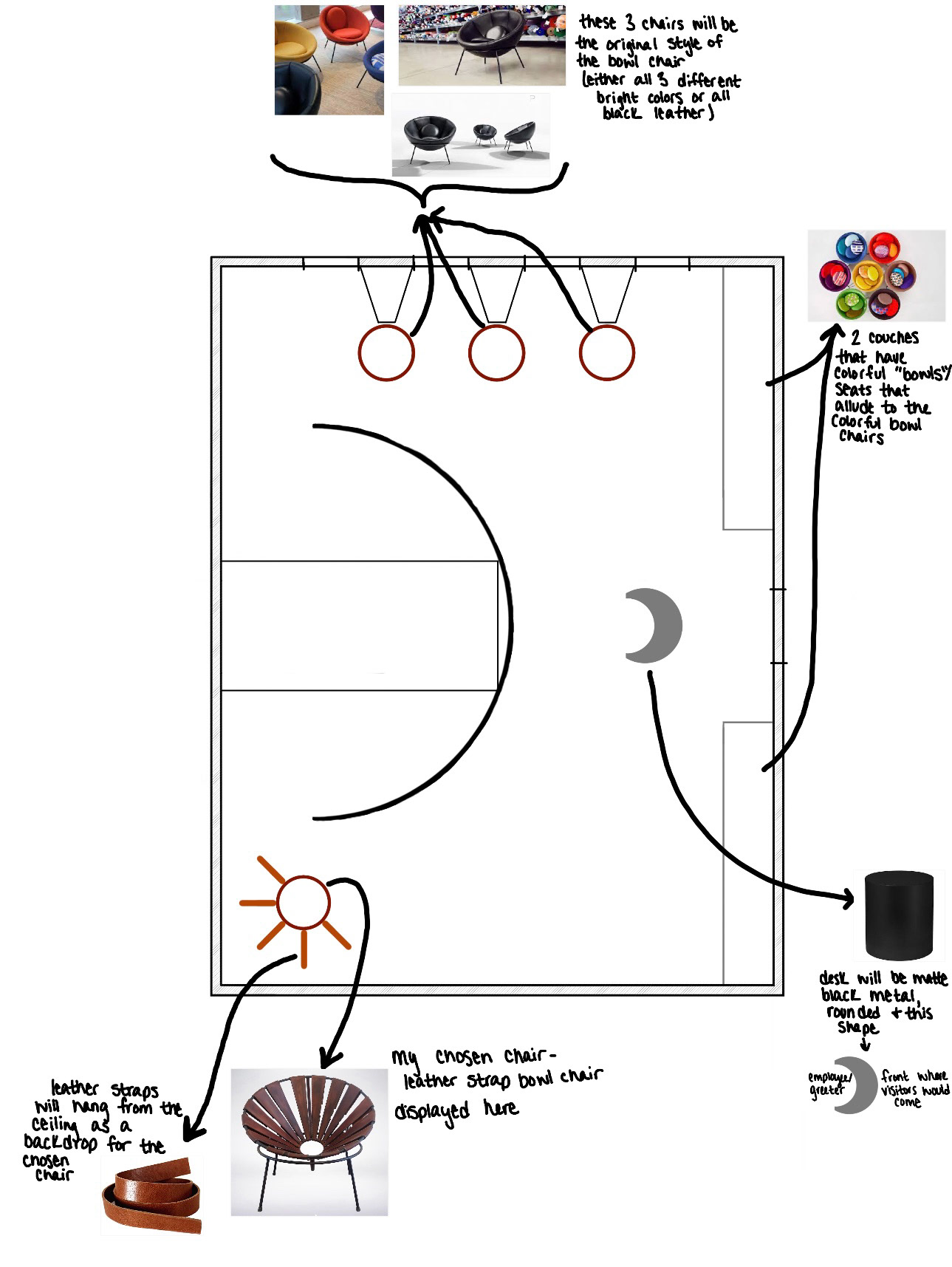
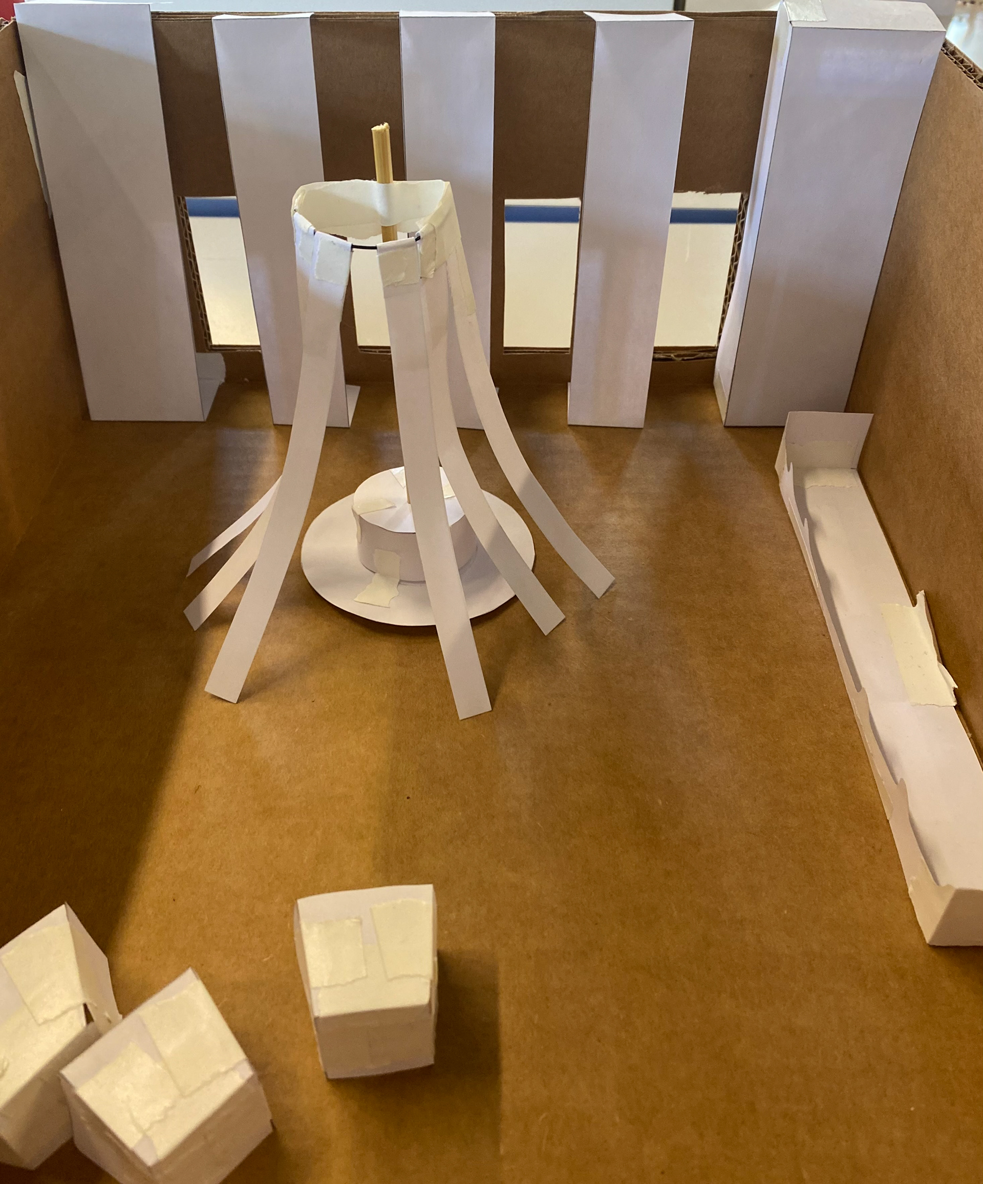
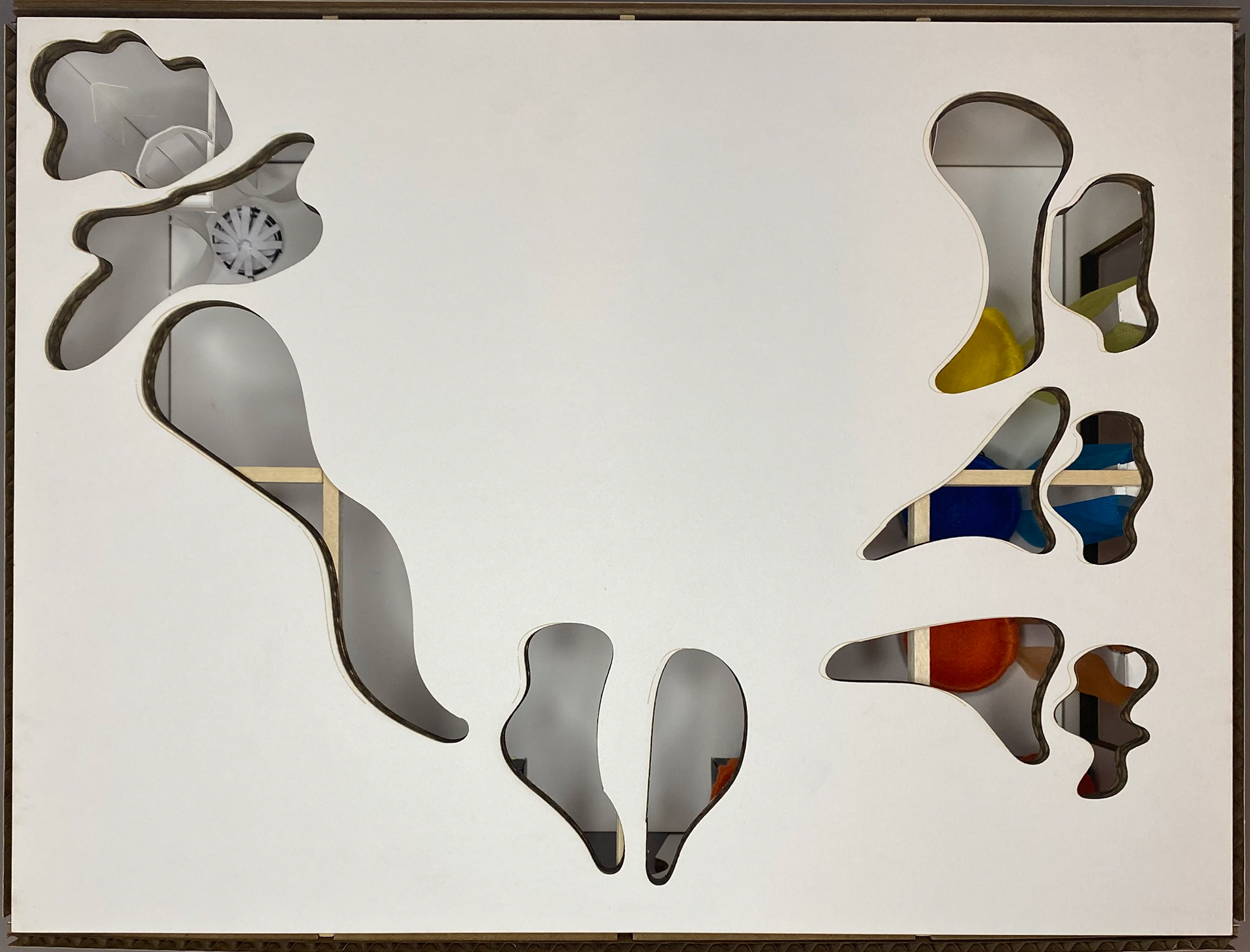
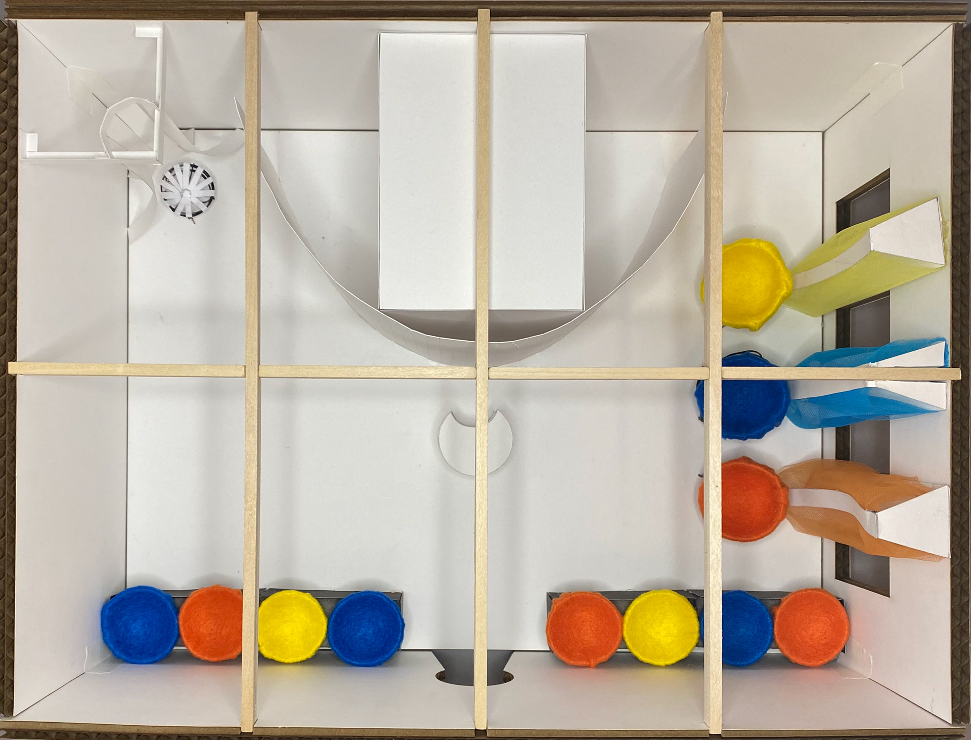
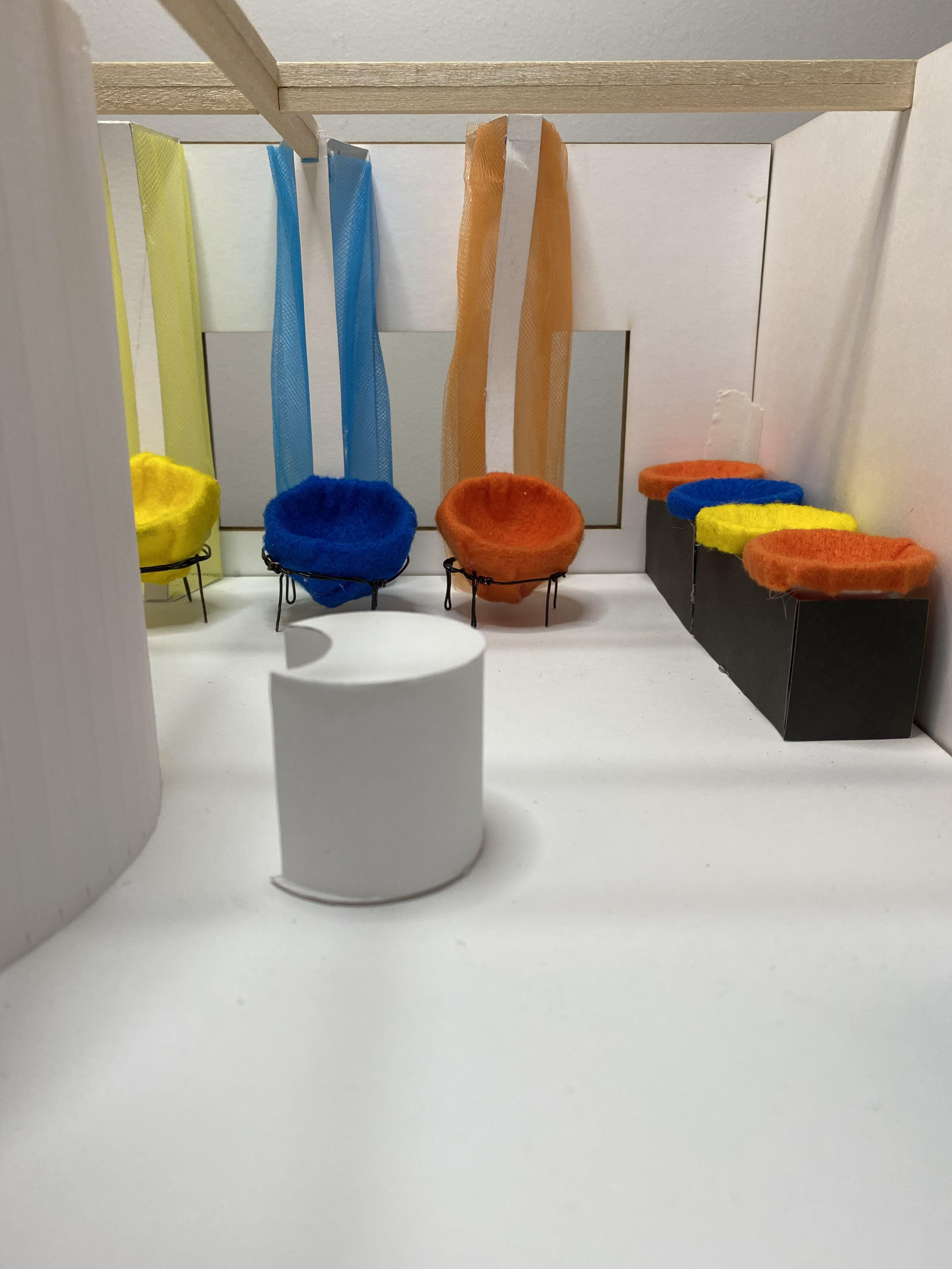
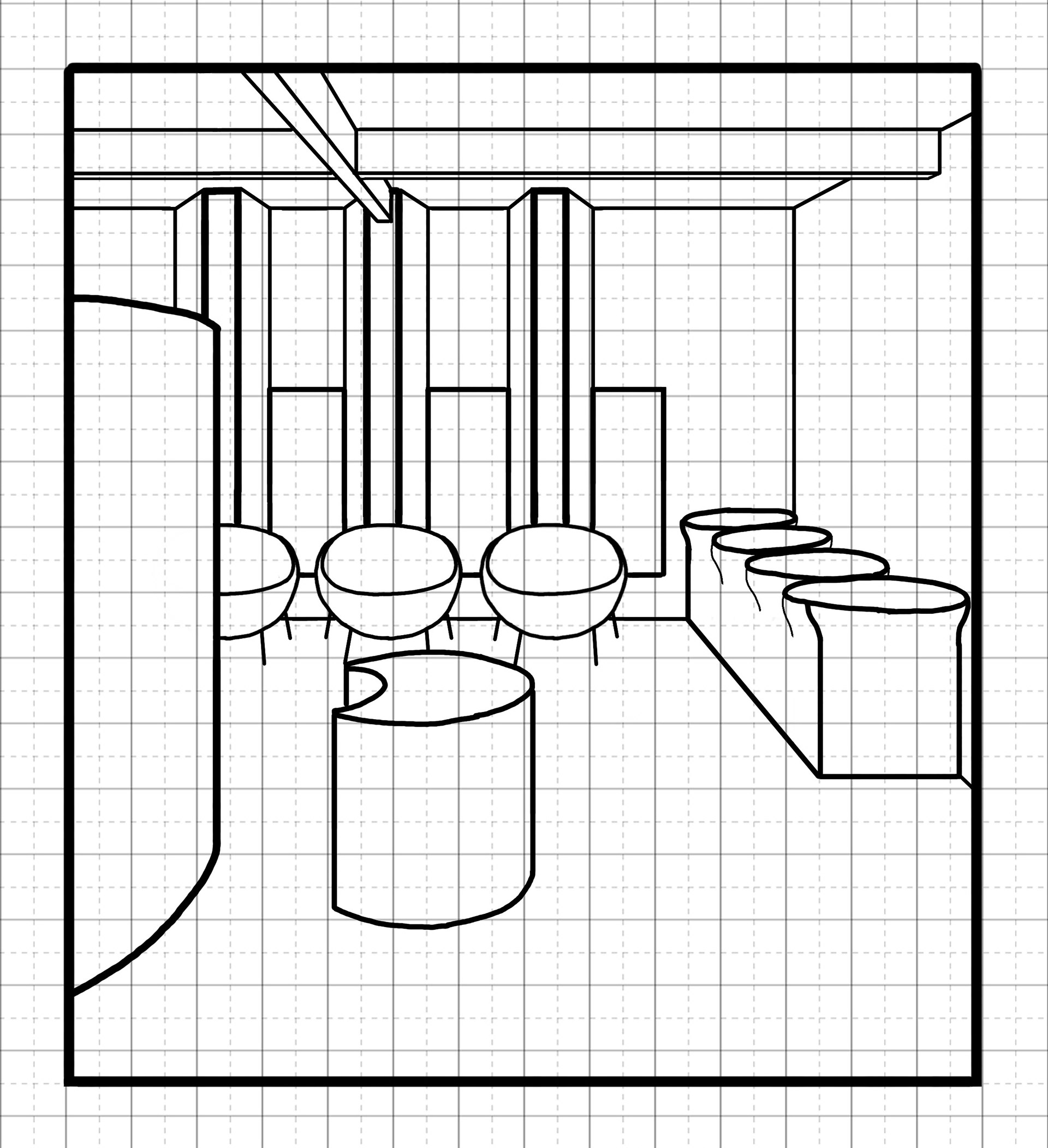
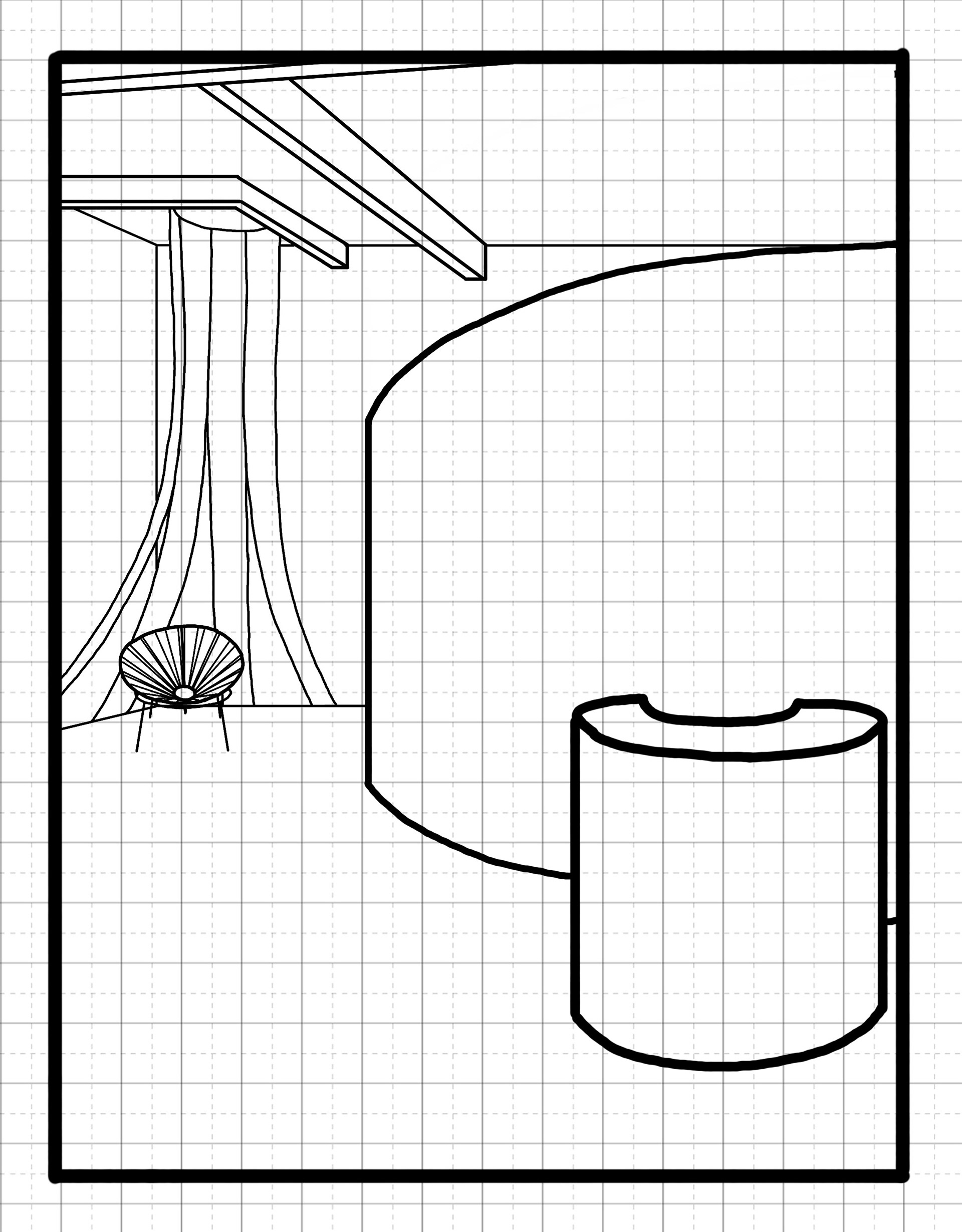
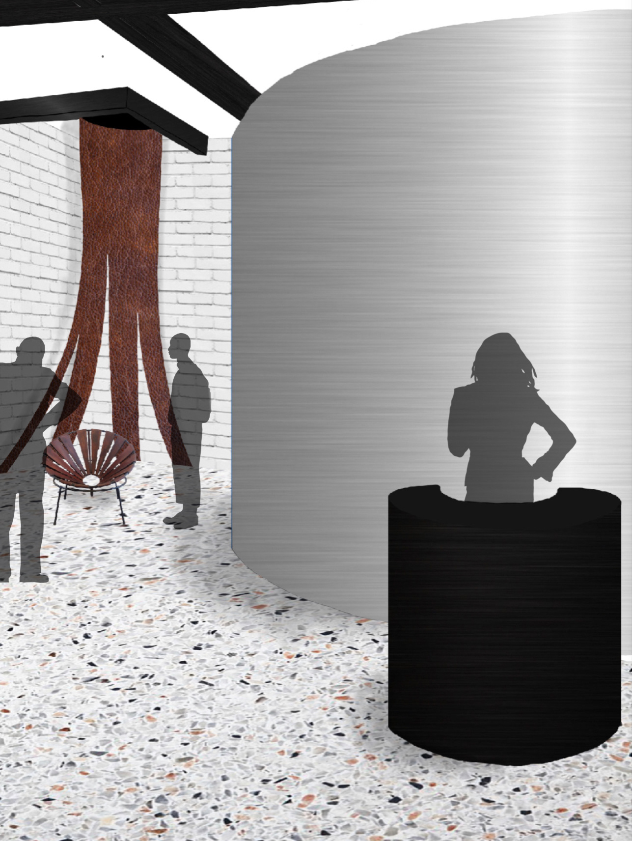
After gathering some inspiration, I began sketching out some ideas for floorplans and different details around the museum space. I was focusing, at first, on the architectural piece with leather straps, then I experimented with other details of the space. After numerous iterations for the floorplan, I decided that I wanted to include both styles of the Bowl Chair, the typical filled textile one and the leather strap one. I wanted to have a distinct opposition to the two Bowl Chair styles. One side of the room would be focused on the bright colors and more organic shape of the design that everyone thinks of for the Bowl Chair with a few different colors of the chair placed in front of bright windows, while the other side of the room was focused on the leather strap design of the chair and its more linear appearance. Both sides of the room have a "background" for the displayed chairs relating to the chair design, such as the suspended leather straps around and behind the leather Bowl Chair. I wanted the form of everything else in the room to be influenced by the rounded form of the chair, as well, like the entrance, reception desk, wall hiding the storage closet, and benches for guests to rest and observe the chairs.
I then began to make 3-dimensional iterations to test out some of these details and to start laying out different parts of the floorplan. I made a rough draft of a model to start testing out the ideas that I was drawing in an actual space and see how they would interact with each other. I practiced making different pieces, like my bench, chairs, leather strap backdrop, etc. This allowed me to move items around in the space and helped me to make some final decisions for my model before moving on to the final version.

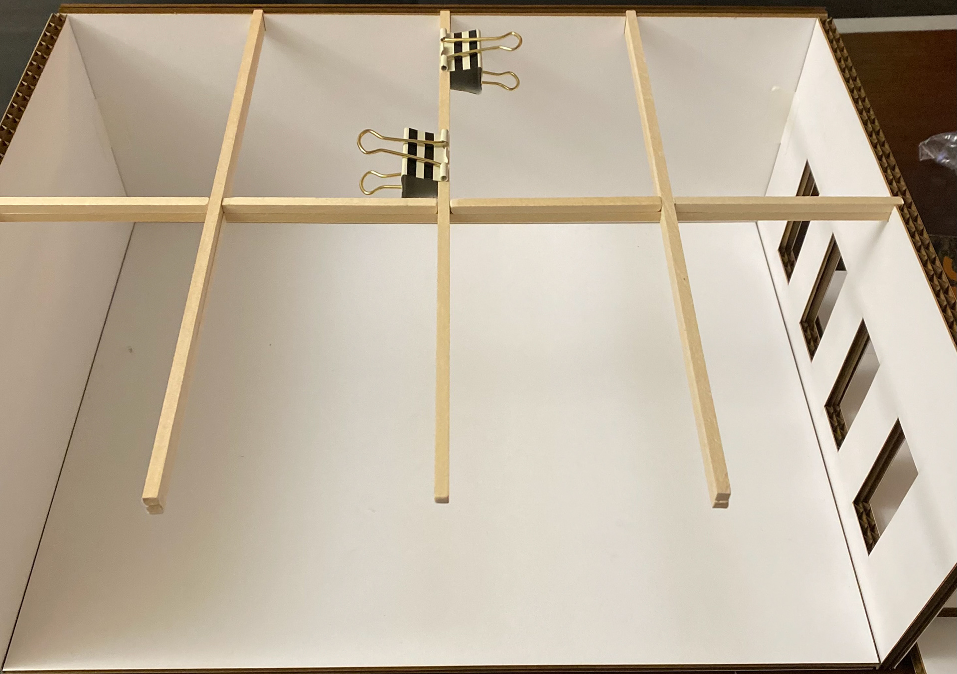
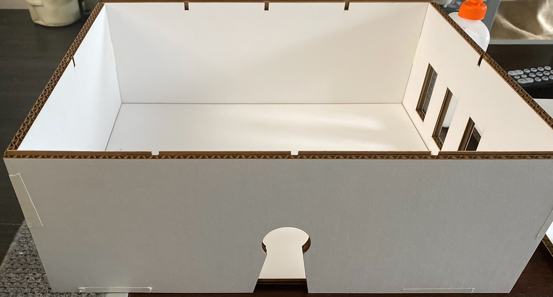

Final museum model:


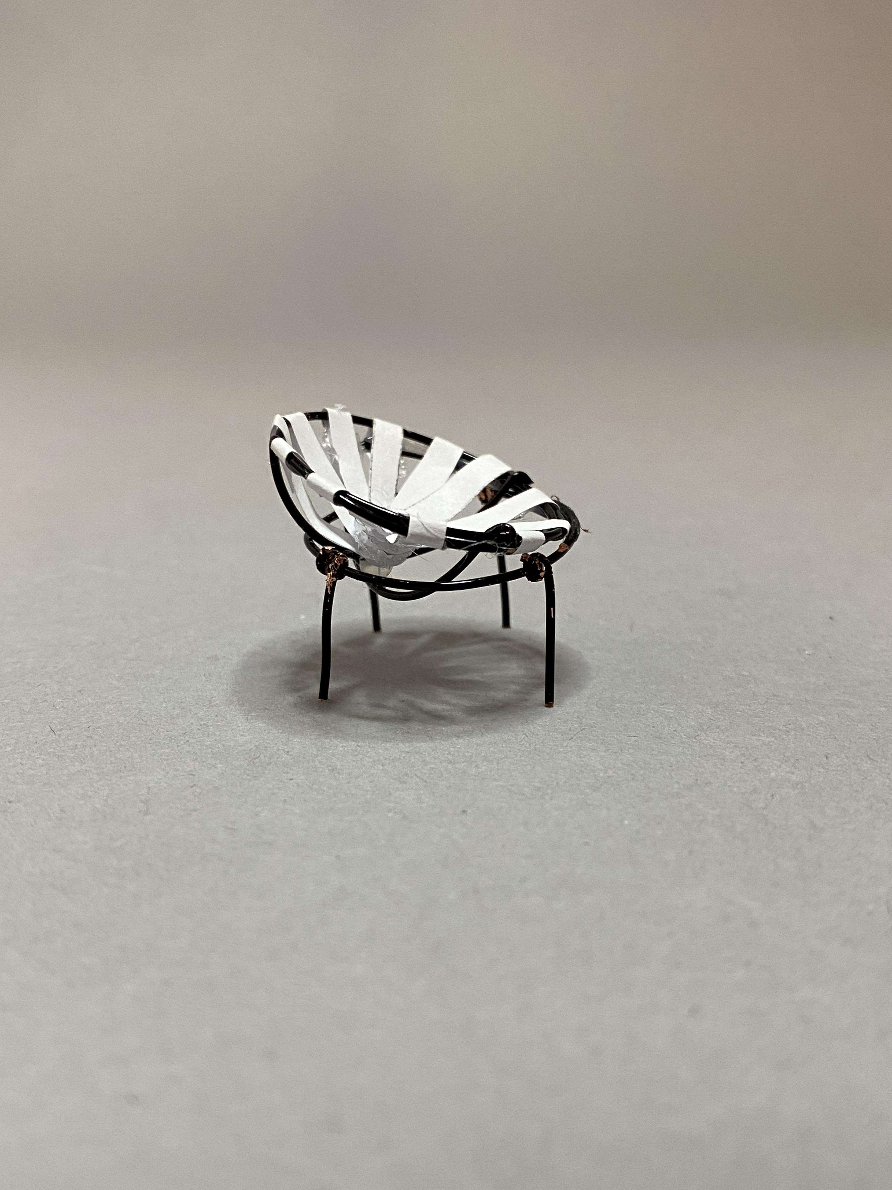
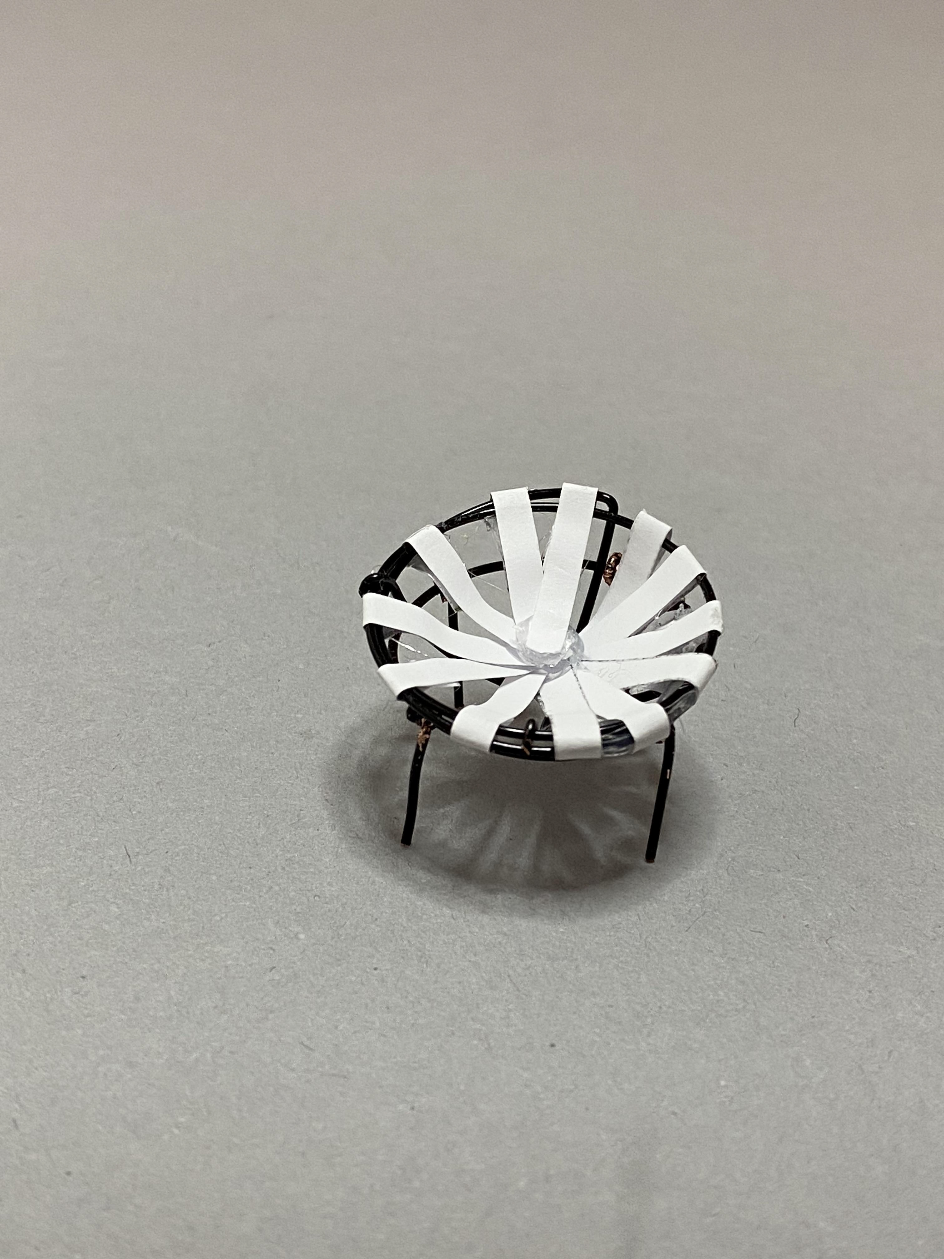
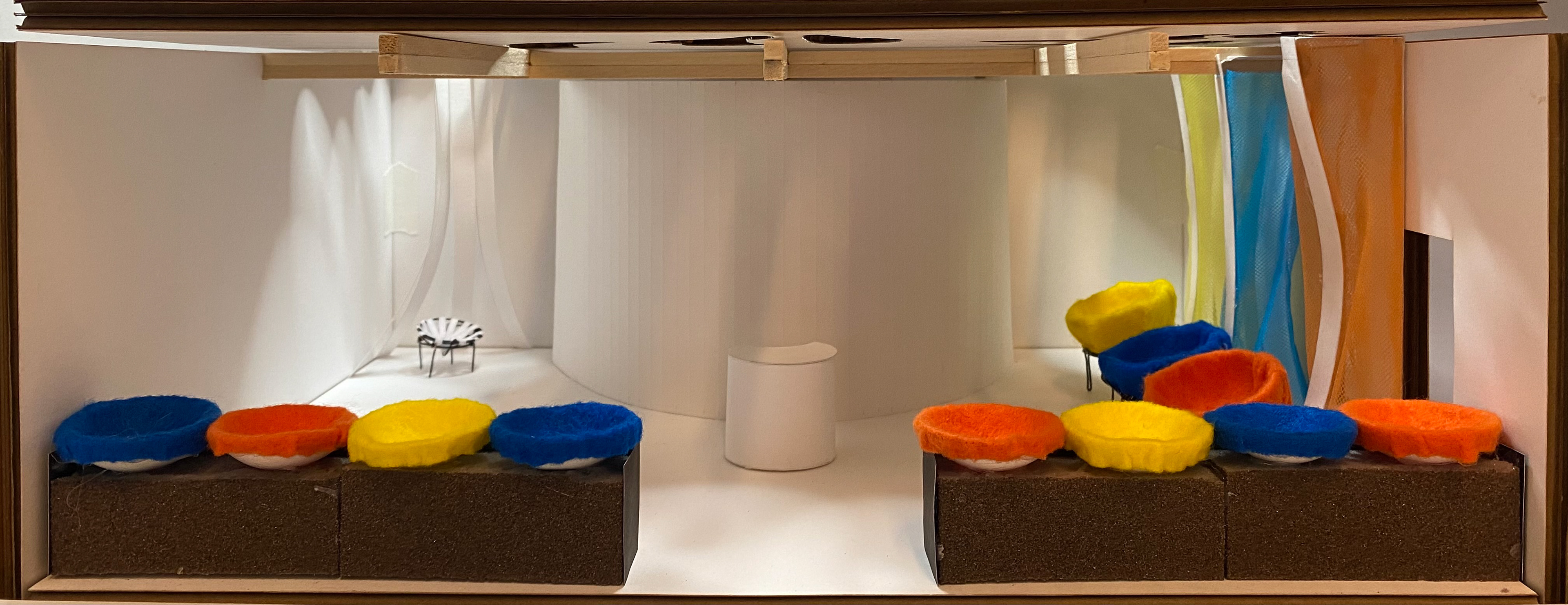
Final Design Drawings:


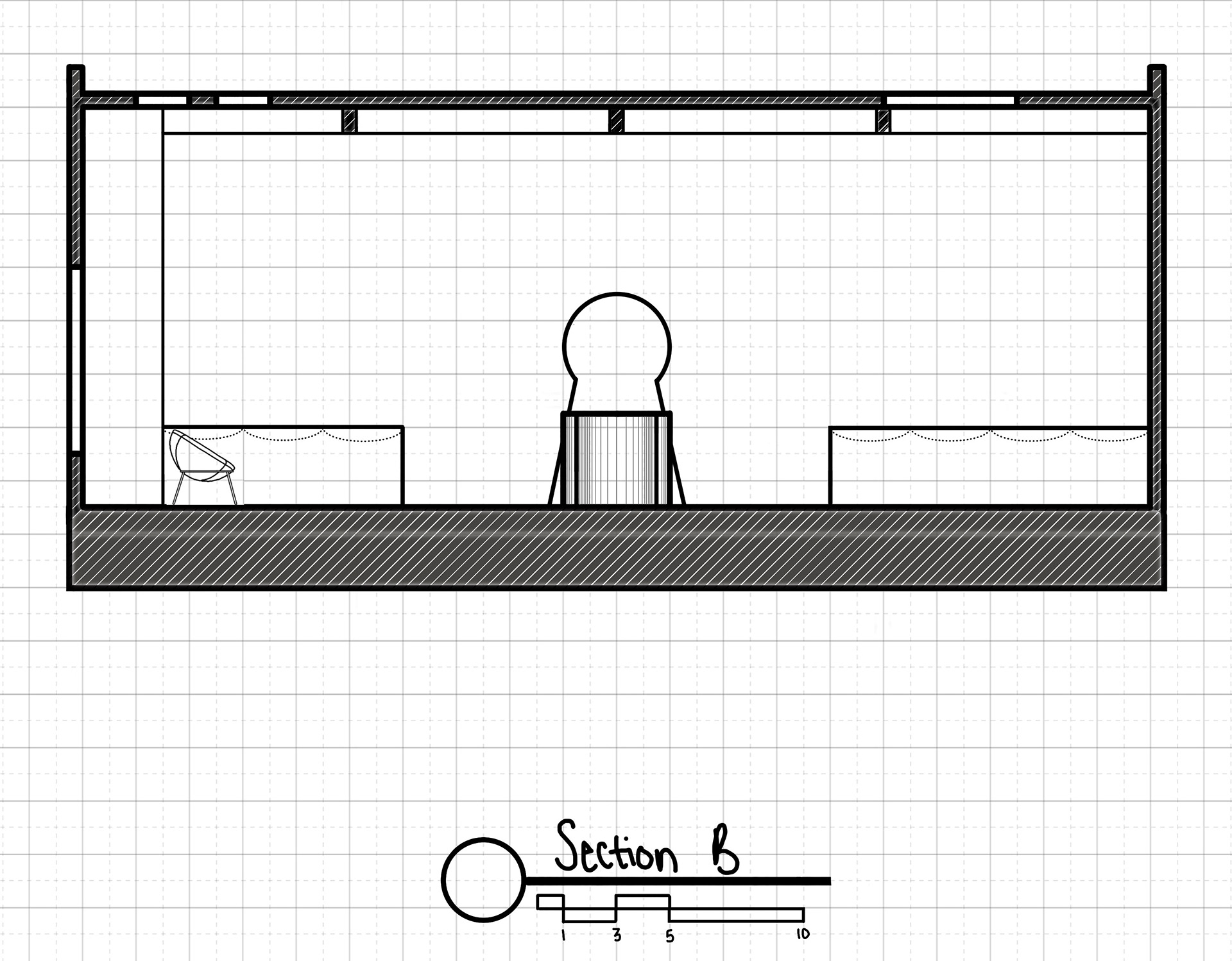

Project Reflection:
What drew me to the leather strap Bowl Chair, in the beginning, was its unique form and how different it was from the other style of Lina Bo Bardi’s Bowl Chair, so, with this museum design, I am showcasing their differences by placing the styles on opposite sides of the museum and including characteristics of their style within their environment of the room around them. The rounded shape of the seats on the benches hints towards the Bowl Chair, and their bright colors relate them to the original style. Since the colored style is the more well-known version of this chair and there are many more of them, I wanted the leather strapped chair to stand off on its own and stick out, which is why its backdrop is the only element that resembles it within the museum. The colored chairs also have walls behind them that draw more attention to them. When visitors enter the space they have to make the decision of which style of chair they are going to see first, further separating the chairs, and causing visitors to have different experiences or sequences of events. The skylights light up each of the chairs and an implied path to the chair. Also contributing to different framed views is the storage area by jutting out into the space, it inhibits viewers from seeing the other display from the opposite side. Since the difference in materials is so important to the different appearances of the chairs, I made many of the materials within the museum related to the chairs, such as the colorful fabric bench seats, black metal desk and storage area, colorful terrazzo flooring, etc.