Project Brief:
The goal of this project was for us to create a 3-dimensional space based on the design of a pattern that we created by merging other found patterns. This project was broken into numerous parts, the first being to choose three found patterns for guidance for the rest of the project. For each of these patterns, we were to recreate variations of them and make new colorways. We were then to design three new patterns by merging together two of our three recreations. We chose each of our favorite patterns of the merged ones to start building a 3-dimensional relief from. Starting by making 5” x 5” x 5” reliefs, we were experimenting with different ways of adding a new dimension to our pattern. After these ideations, our final model, which was double in size, was supposed to represent a pavilion that people could be inside of, while the final pattern would inform its shape.
Process:
The first pattern that I really stuck with was lace trim. Since lace has common patterns within it, I decided to find something other than lace for my other two patterns, but I wanted to keep them all related, somehow. I chose to research other things made of silk and found neck scarves, which originated in Ancient Egypt, so I picked an ancient Egyptian pattern. I also researched parachutes, which originated in 18th-century France, so I chose a French pattern from that time period.
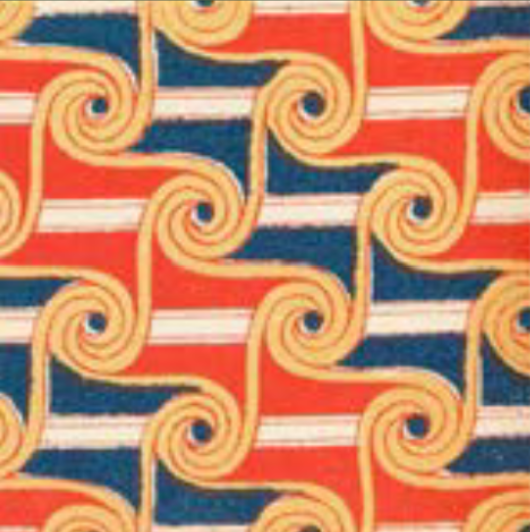
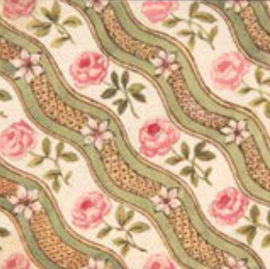

For my final patterns, I played with scale, emphasis on different parts of the merged patterns, color, and contrast. I also enjoyed experimenting with how to make certain elements feel as though they are in the foreground versus others.
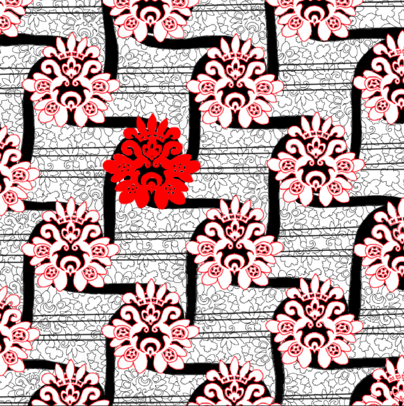
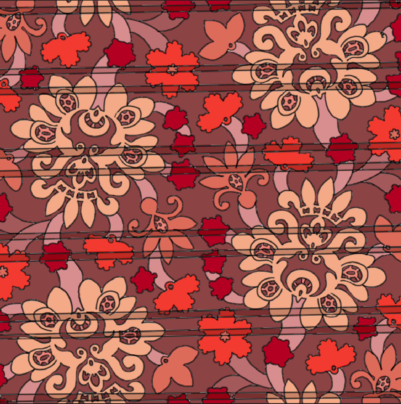
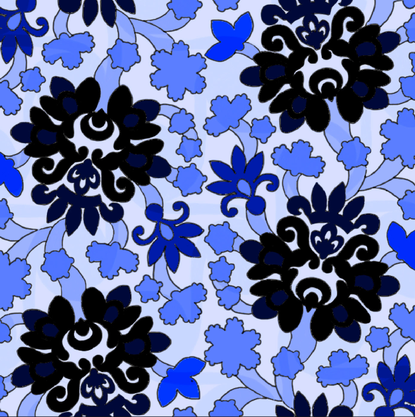
This is the pattern I chose to continue with for the rest of the project. To start making my patterns 3-dimensional, I decided to crop down my pattern to make the amount of detail more manageable.
I then began extruding the pattern into reliefs. When first playing in this 3D realm, I experimented with giving height to various of the different details within the pattern, trying to figure out what I wanted to give emphasis to. I started by drawing out different ideas for these models, then I came up with four different physical iterations. I liked my last one the best, where the four lines connecting each of the flower shapes are 3-dimensional, but at varying heights, which ascends around the flowers.

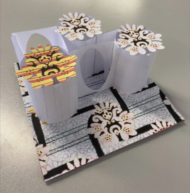
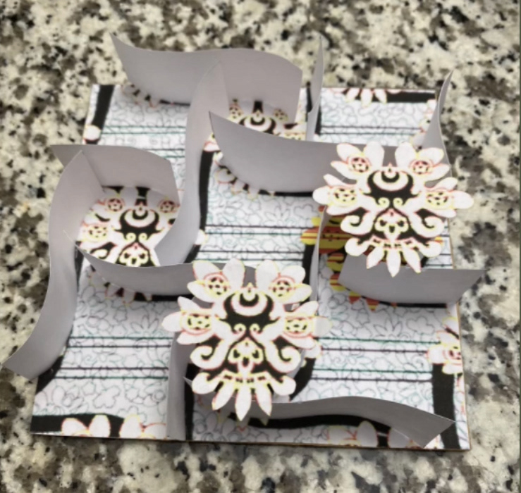
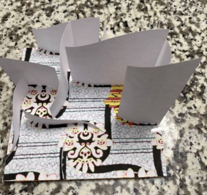

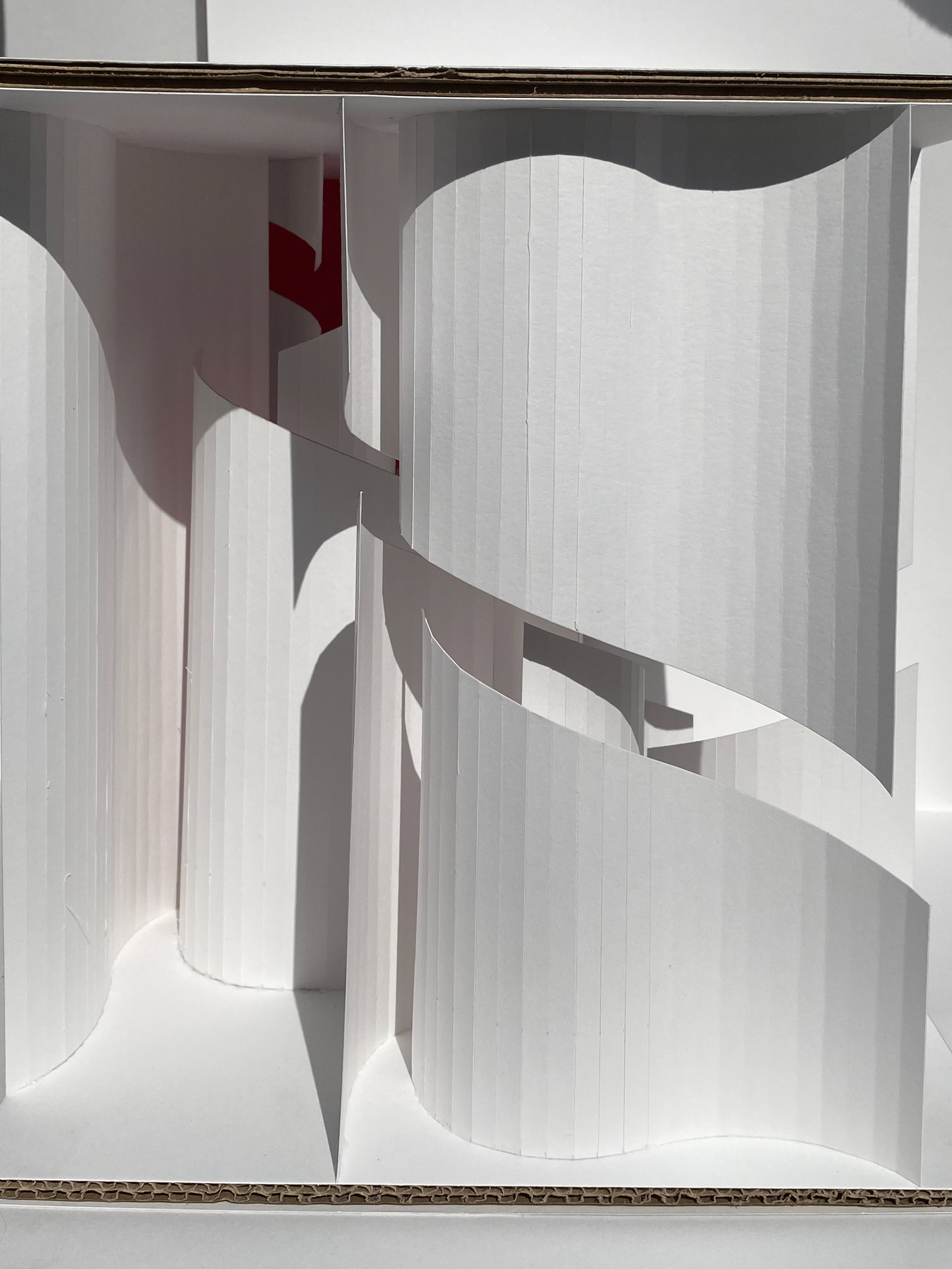
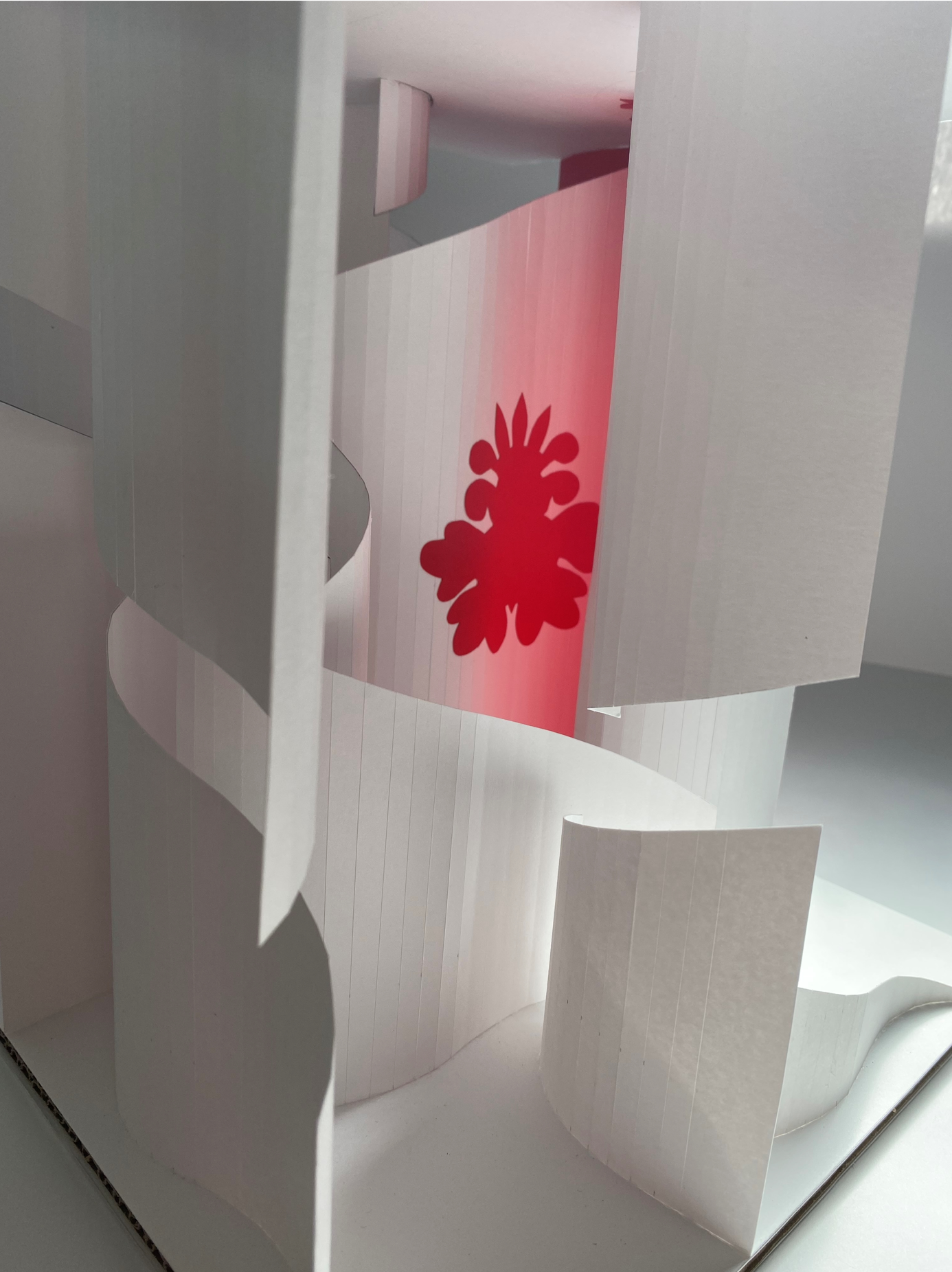
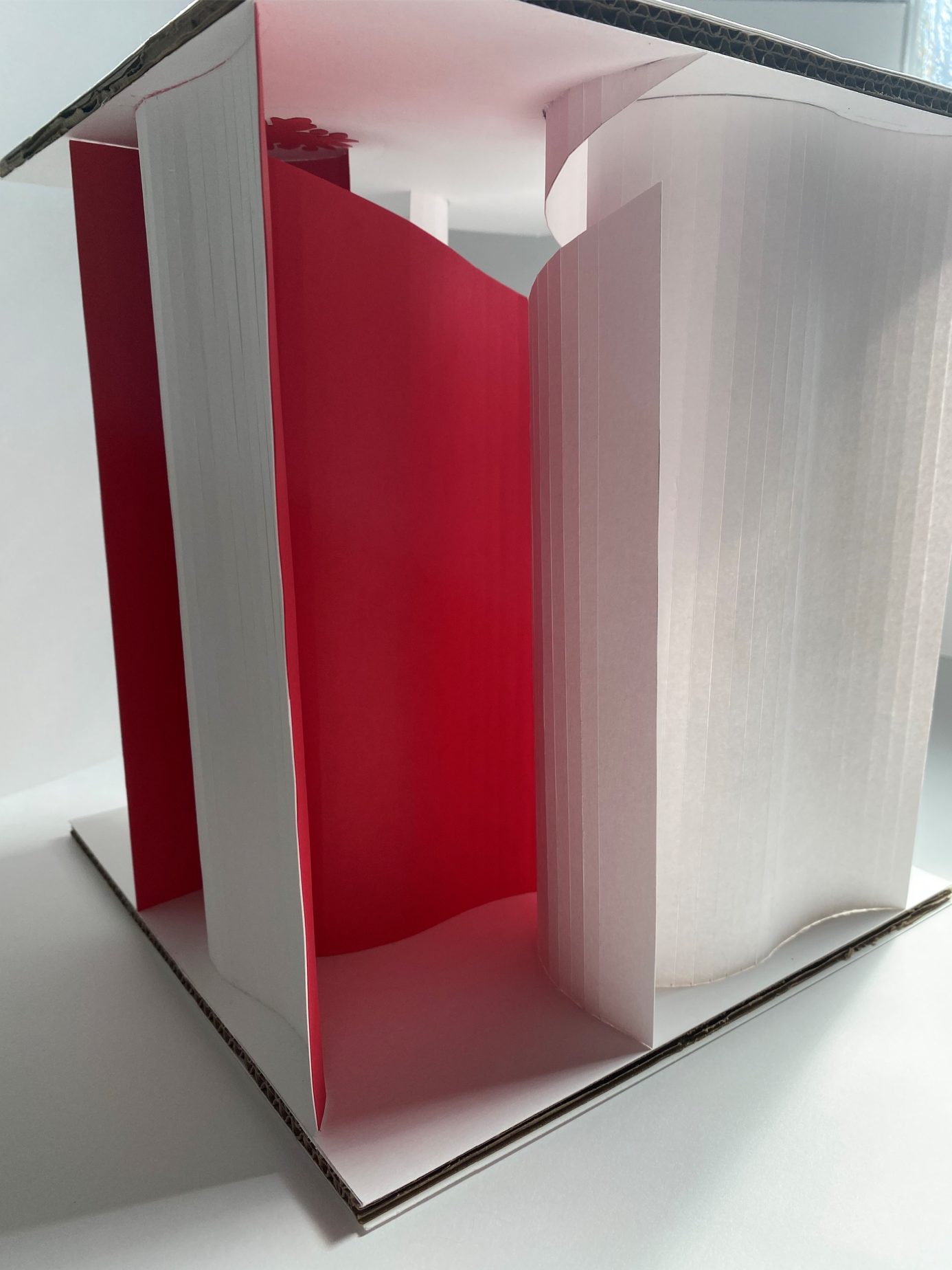
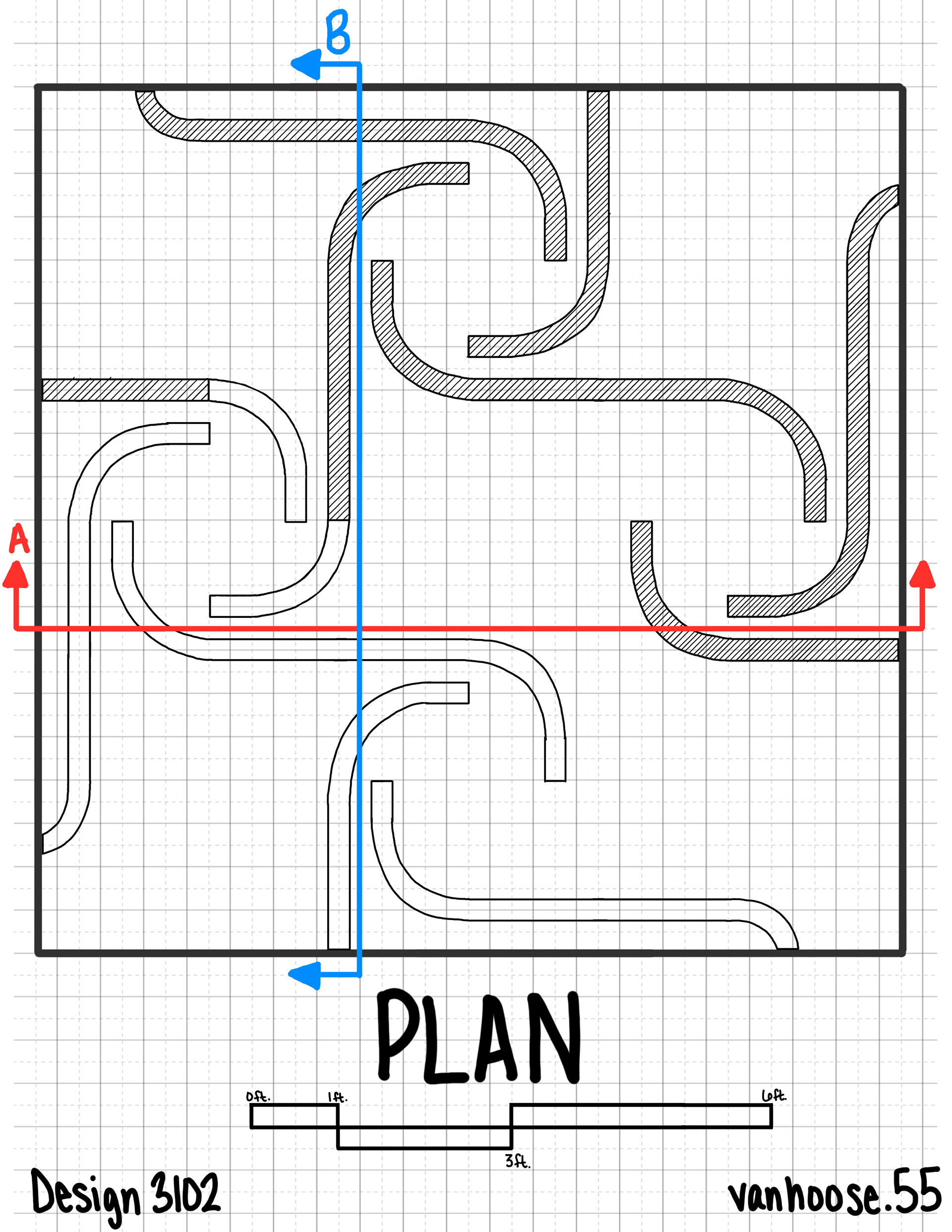
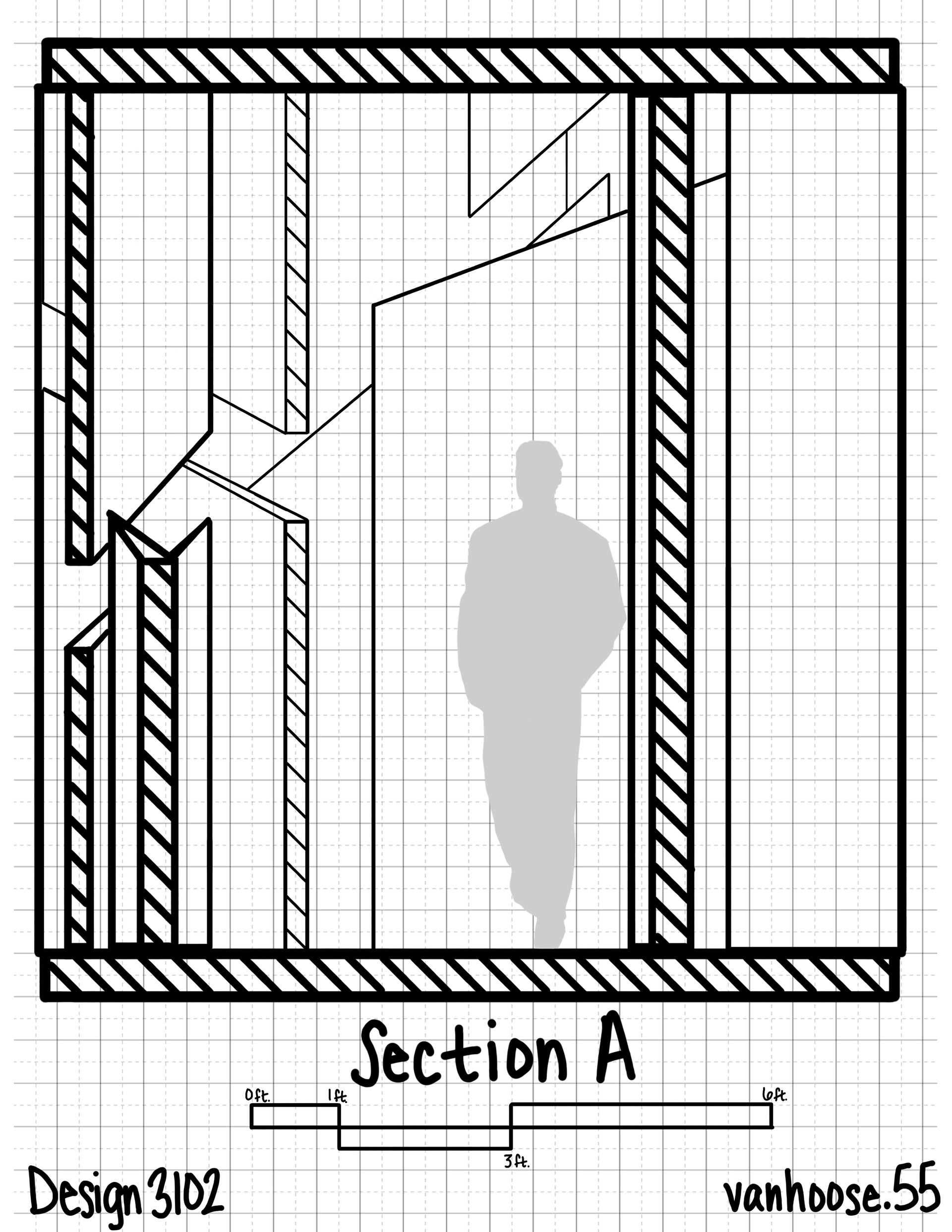
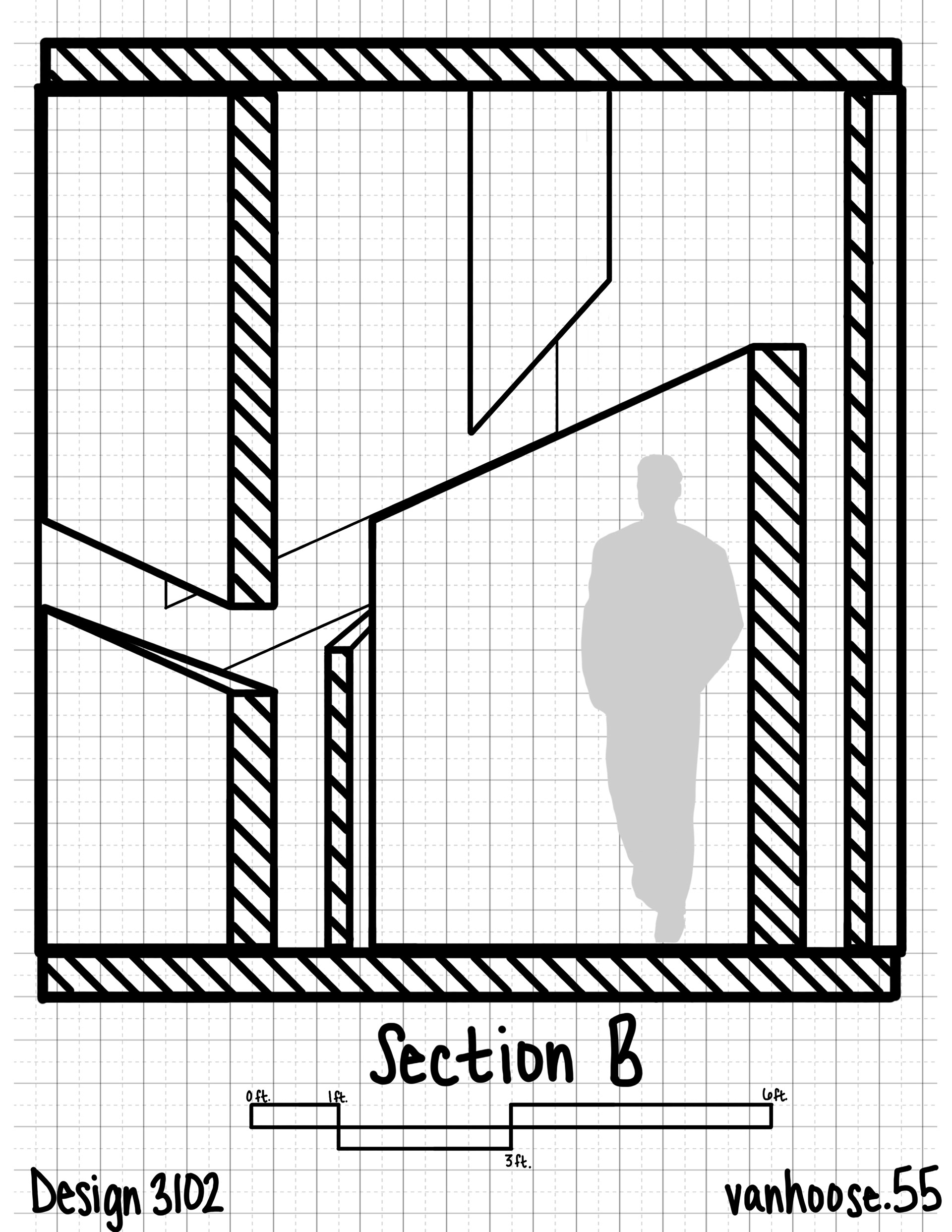
From these reliefs, I started to make larger 3-dimensional models, iterations of the final pavilion. I decided to stick with my relief idea of having the flowers at ascending heights, however, I added walls coming from the ceiling, leaving a 1’ gap between these walls so that the change in height was still evident. I also added color, as I wanted to use the rounded surfaces and to play with having color reflected into other areas of the pavilion. I used the original flower shape from the pattern and tucked it in a narrowing space where the color is flooding out to draw attention to it
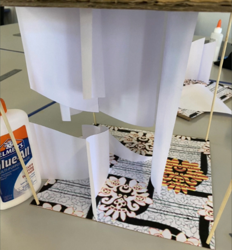
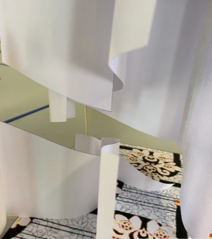
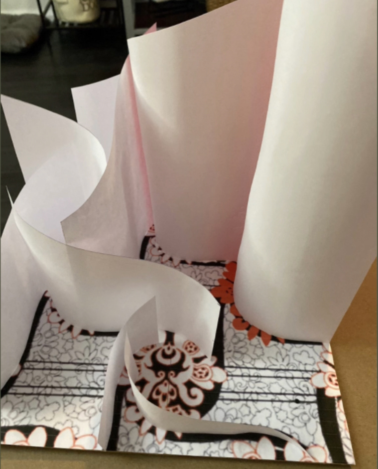

FINAL DESIGN:
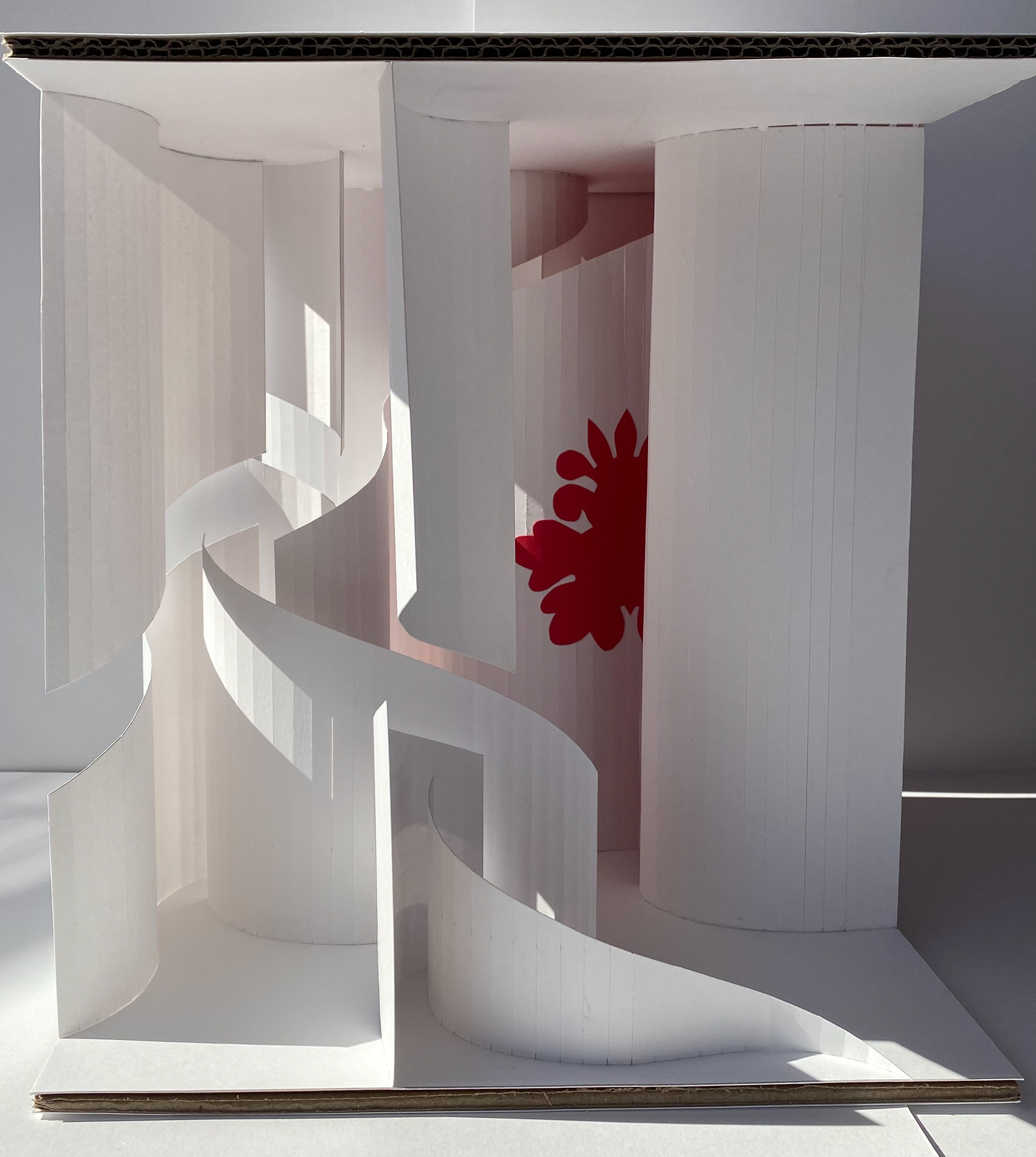


Project Reflection:
Overall, I am happy with how my final model turned out. After making the reliefs, I needed to start thinking about the final model and envisioning my design as a pavilion, a space that people could be inside of, not just a 3-dimensional version of my model. I had a hard time seeing how people could go through this space. I, then, realized that even though I wanted the structure of my space to be quite detailed, the visitors did not have to be able to actually walk through every area within this space. My pavilion is more for people to go inside through the entrance, (the gap between the shortest and tallest walls) look around in the middle, and take all the different components of the design in, like the angles, varying heights, shadows, color, etc. I wanted the space to be complex and interactive, but for people not to have to actually meander all the way through it. They can experience everything in the open space in the middle. Since I simplified my pattern design for the model, I also wanted to make its influence more evident, which is why I included the flower shape on one of the walls and incorporated the color red for the lighting.