Project Brief:
This project was to design a boutique hotel that is located in New York City right along High Line Park. The developer wanted the hotel to compete with "The Standard Hotel," along with being the future of hospitality. The design of the hotel was to be inspired by the High Line, which has a mixture of historic industrial and greenery. The developer wanted nature to be one of the main implementations in the concept of the lobby design. The challenge of this hotel lobby design was to redefine the hotel experience to make it personal, unlike the typical big chain hotels. We also had to define our target audience for the hotel. The requirements of the hotel included a reception with storage, a hotel manager's office, a place to "rest and recharge," a place to "work and play," a cafe or bar, two single-stall restrooms, vertical circulation connecting the first and second floors, a connection to the High Line, and an additional public space to serve our target audience. We were also all assigned partners for this project, so I worked in a group with three of us in total.
Process:
My partners and I started our hotel design by gathering inspirational images in various categories and narrowing the selections down to try to really get a good idea about what we wanted the feel and concept of the lobby to be and what some of the architectural elements and materials we wanted to incorporate were.


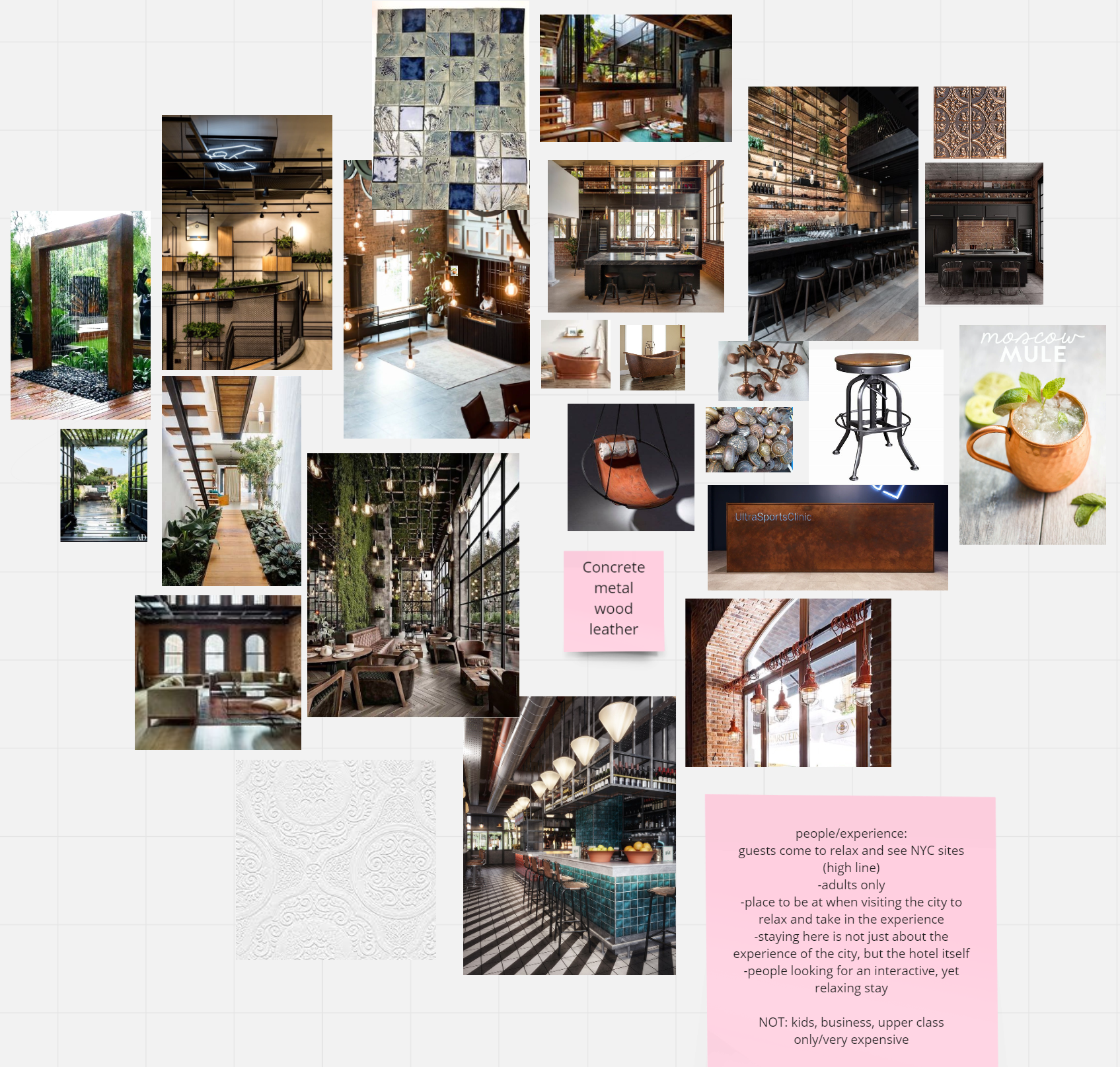
From all of these inspirational images, we created three visual positioning boards of our main design themes: an interactive experience, a rustic luxury aesthetic, and a biophilic design. These three boards then informed our overall attribute board for our design and our concept. Each of us partners completed one of the boards, and I did the middle one, rustic luxury.

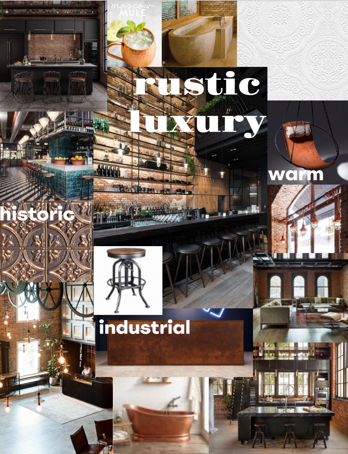
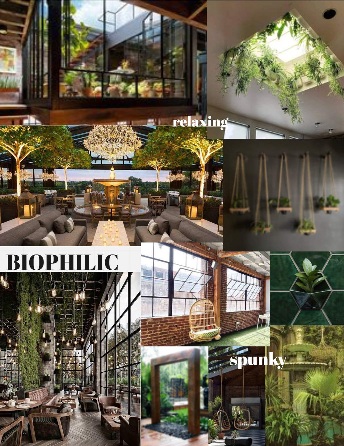
Concept Statement: The concept for the hotel is to provide a calm, relaxing, and welcoming environment in a city that might not always feel that way. Guests can enjoy the rustic luxury design with large open spaces, tall ceilings, big windows, and numerous nooks for guests to feel some privacy while they relax. The biophilic design is also relaxing, yet interactive for guests to enjoy their stay here. Within the hotel is a greenhouse that allows guests to help care for the garden and pick their own fresh produce, as well as make their own ceramic tiles with imprints of the fresh-picked plants. This hotel is the perfect place to get away from the business of the city when guests have finished exploring for the day.
After defining our concept statement, my group created some personas of the type of people we thought would visit our hotel, people who were visiting the city and needed a place to stay that would be relaxing and comforting to them away from the city chaos, like an oasis. Those visiting the hotel would be guests staying there, along with other visitors coming off the High Line to experience the public spaces within the hotel lobby.
We then created a material board palette so that we could focus on the materials we had chosen, based on our visual positioning board. This would guide our choices when making our perspectives.
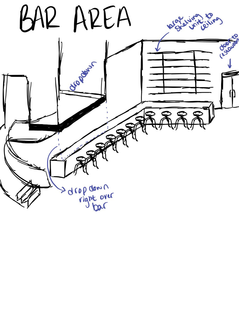
Each of us, partners, created our own sketches of what the lobby might look like and different iterations of the floor plan before we came together to merge our ideas into one. Below, I included just a few of my sketches as examples.

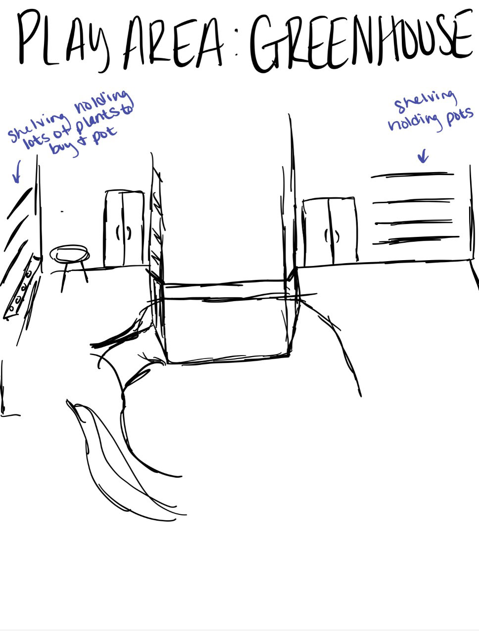
Before creating our final floorplan together, we made an adjacency matrix and criteria matrix to help us better lay out the different areas of our plan. We also practiced bubble diagraming to really try to understand how close we wanted the different spaces to be to each other.
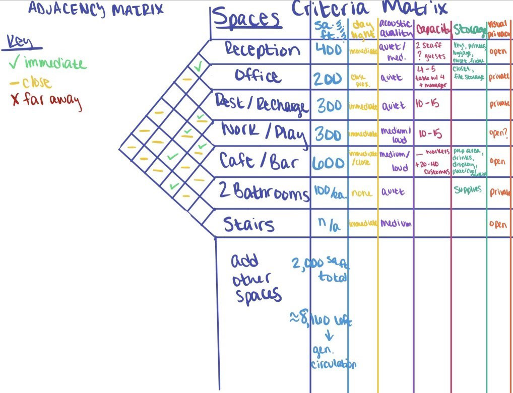
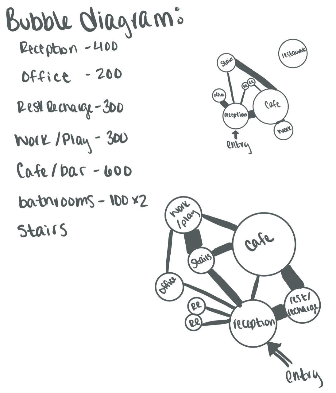
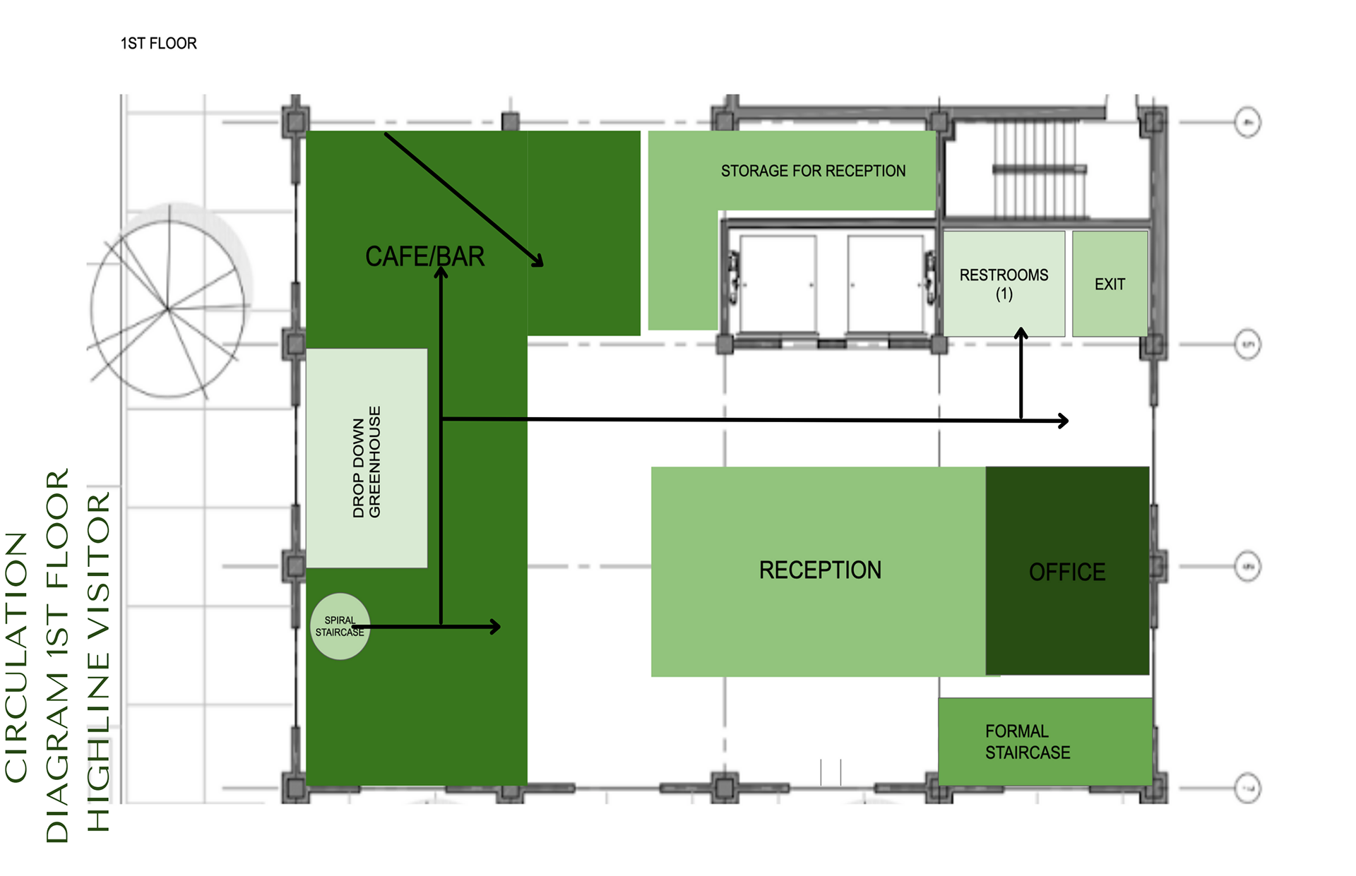
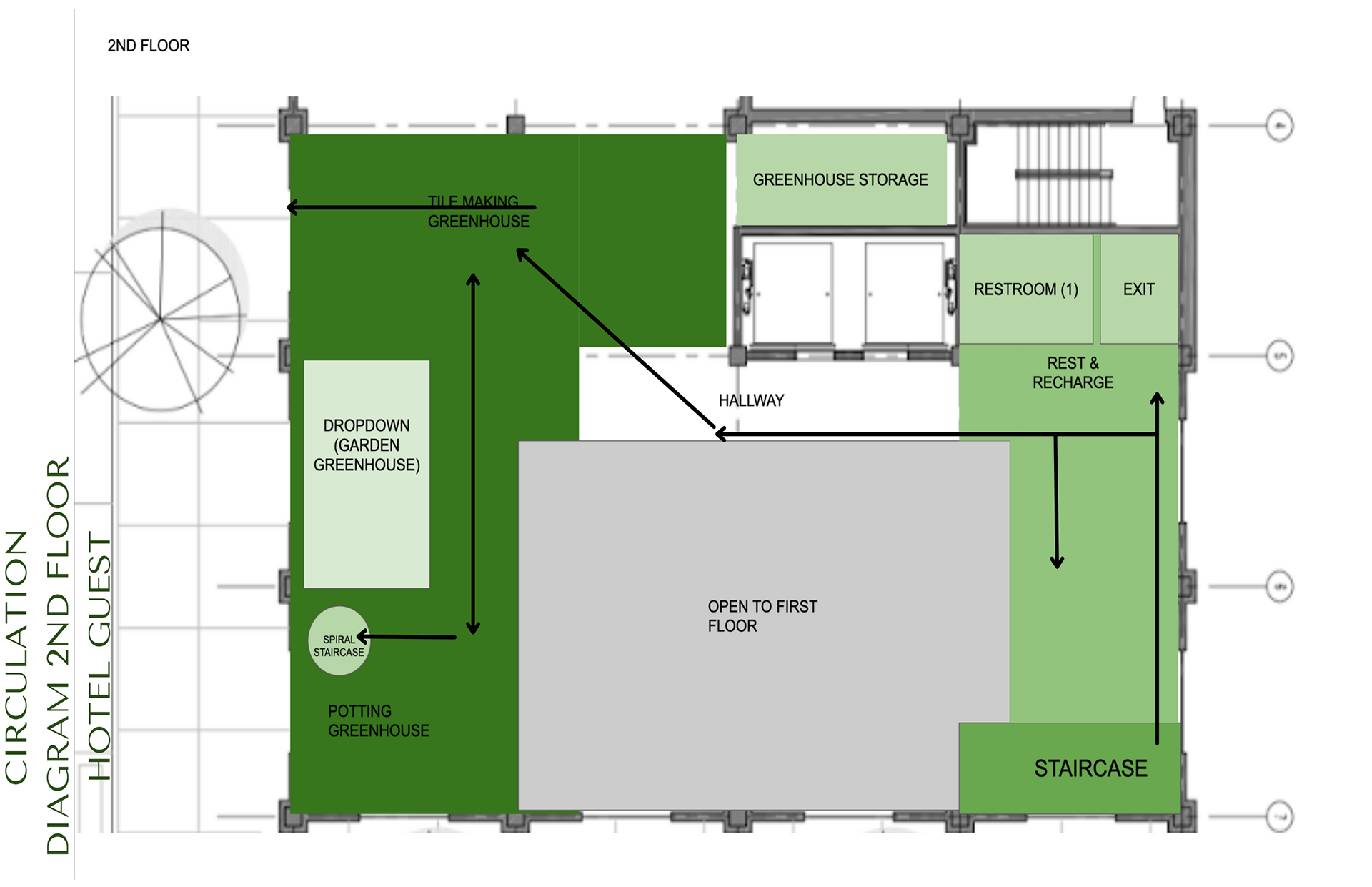
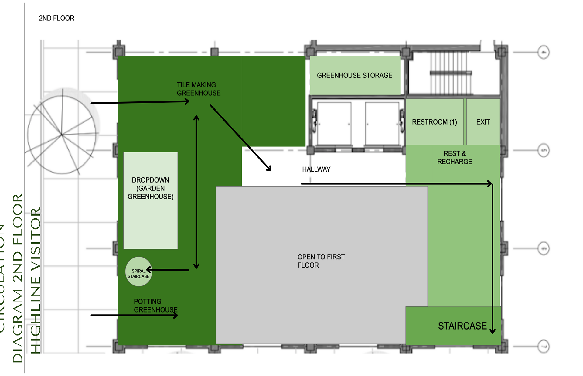
Together we created block diagrams for the floorplan and circulation diagrams to see how both hotel guests and visitors would be moving about the space
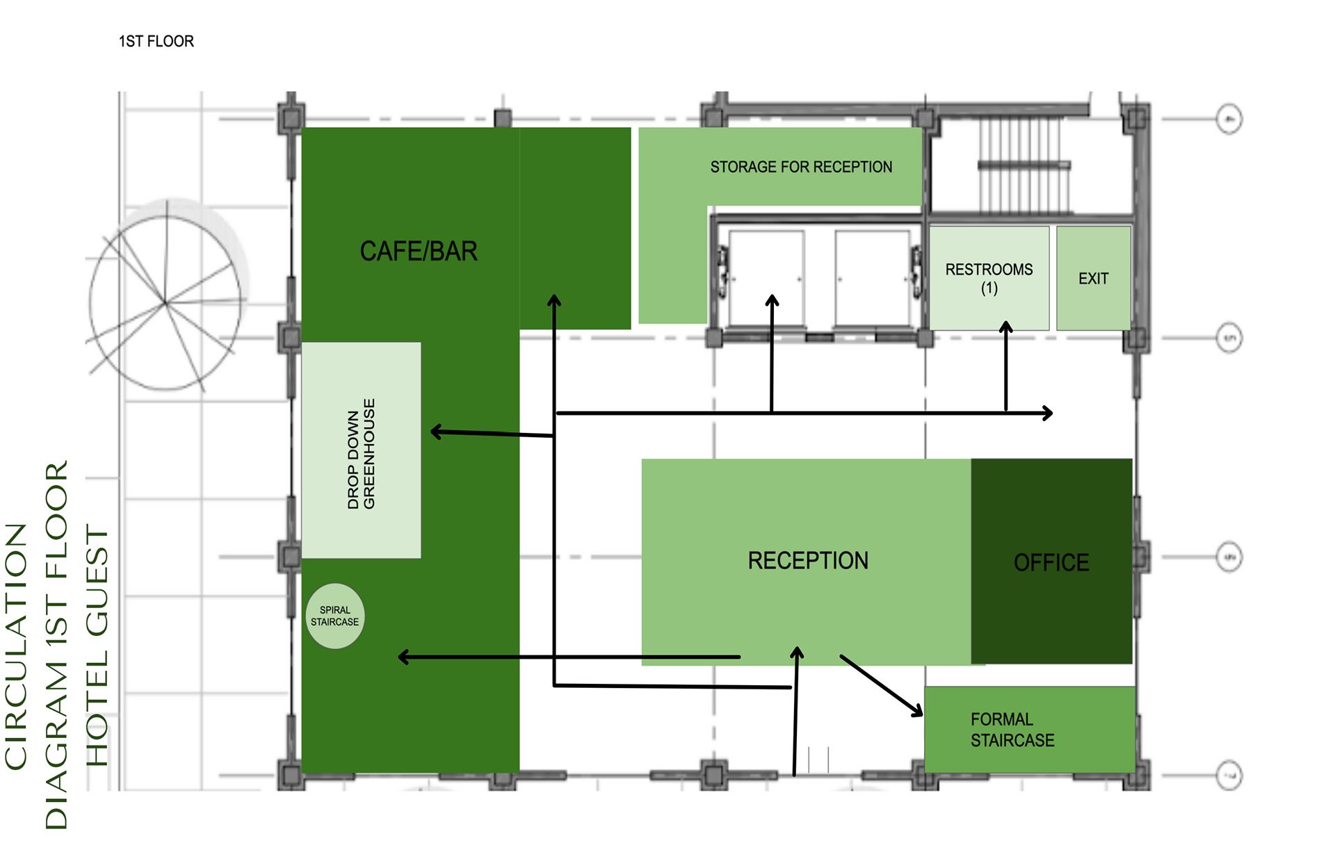
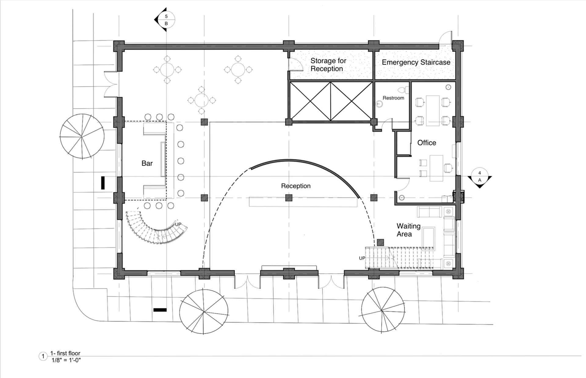
Final Floorplans and Sections:

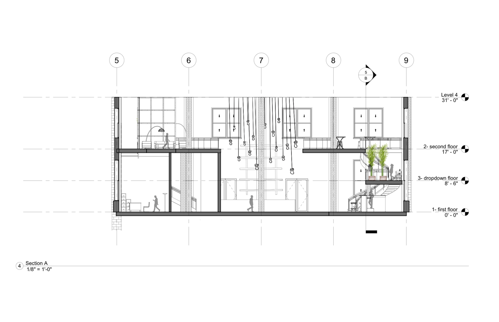
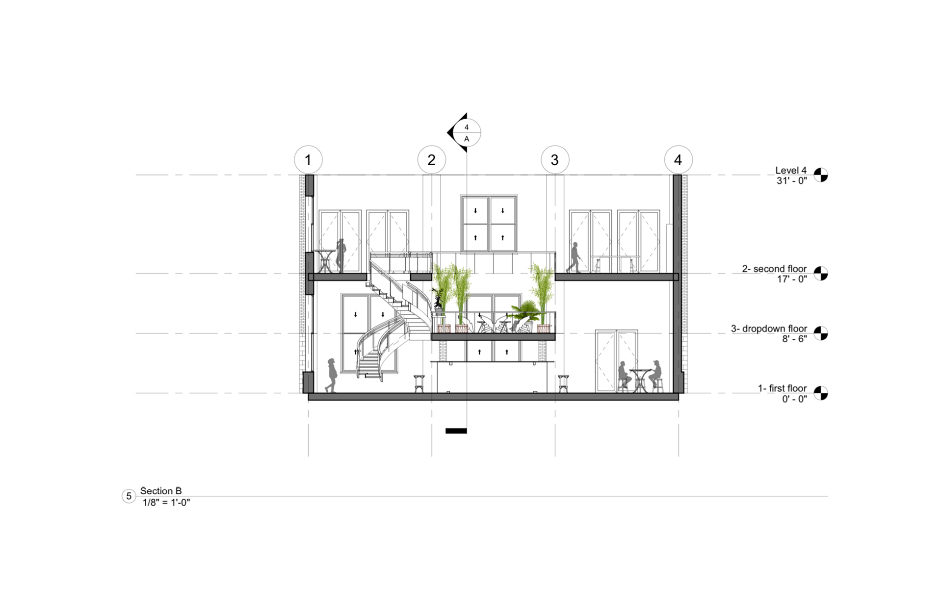
Final Perspectives:
These perspectives depict the reception area on the first floor, the pottery/tile-making studio upstairs, and the bar area, which also shows the greenhouse dropdown directly above the bar, where guests can explore an oasis of greenery between the first and second floors of the hotel lobby. Each of us partners completed one of these perspectives, as well, and I made the last one showing the bar and dropdown.


